Source: http://www.lynneyun.com/bio
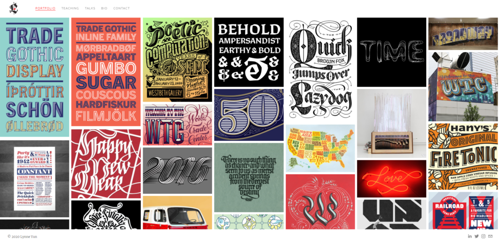
Lynne Yun is a type designer and educator based in New York City. She is famous for her work in typography, hand lettering, and calligraphy. Lynne enjoys the balancing act of form and function that is required when designing tools for communication, from crafting handwritten calligraphic pieces to designing type for the screen.

Source: http://www.lynneyun.com/
As a young font designer, Lynne has gone a long way in this field. She used to be a full-time graphic designer at Apple Inc., Publicis, and Deutsch. She is also a board member of AIGA NY and was previously a full-time type designer for Monotype. She currently teaches for educational institutions such as Parsons School of Design, Type@Cooper, and the Letterform Archive. In terms of awards, Lynne won the Ascenders award from the Type Directors Club, which honors designers under the age of 35 who show remarkable achievement in typography, type design, and lettering. She was also featured in Print Magazine as one of ‘The 10 Most Talented Female Creatives Living and Breathing Letters Today’.

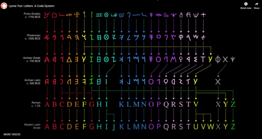
http://www.lynneyun.com/talks
In recent years, she has begun to give a lot of public speeches, mostly about her career and experience sharing. In her speech, she showed the energy and optimistic attitude as a contemporary young designer and humorously said that her work was going backward, since from graphic design to typography, handwriting, and calligraphy seemed to be a “retrogressive” process. However, it reflects that she likes to study the causes behind everything and make better designs. She even studied the origin and development of various letters, including Latin letters, which made her more fascinated by the charm behind the type.

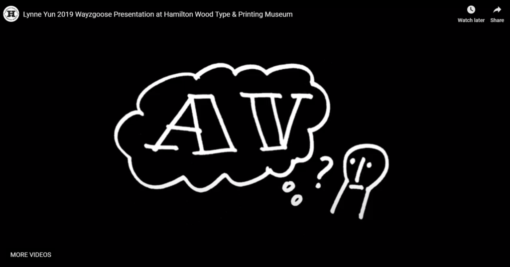
http://www.lynneyun.com/talks
An impressive example is the difference between the letters “A” and “V” she mentioned in her speech. In her BFA period, she began to think about why the left side of A is thin and the left side of V is thick. Finally, after experimenting with different tools, she discovered that it was the consequence of our handwriting. She concluded that the design of fonts has something to do with the tools of writing, and with the movement way our bodies write. This has inspired lots of design students, and let them understand not to imitate design mechanically, but to be good at finding the “code” behind the type design, in order to create more good designs.
Reference:
Lynne Yun, Bio, 2020, http://www.lynneyun.com/bio
Marie Boulangar, Lynne Yun, Type Designer at Monotype, ECV NEWYORK, 2019, https://medium.com/ecvny/lynne-yun-type-designer-at-monotype-9263d4f5763e
Talk, Material Creativity: Finding Inspiration in New Mediums, 2019, http://www.lynneyun.com/talks
2018 WINNER_ASCENDERS COMPETITION_Lynne Yun, tdc.org, 2018, https://www.tdc.org/work/lynne-yun/
