Christopher Alexander’s A Pattern Language inspired me to view architectural design in a completely different way. Before, I have never considered a workplace or a neighborhood that can be such a critical space for connecting people and improving their wellbeing. I always assumed that the architect’s job is to design and build appealing and functional buildings. Therefore, the patterns Alexander created have shown me how intricate it is to develop a workplace that can fundamentally change workers’ experience – essentially, eight hours of their day. In his book, He profoundly demonstrated his systematic and psychological approach to architectural design. His research process showed the importance of comprehending human behaviors. Like interaction design, Alexander conducted many user interviews and analyzed the data before he started to solve their needs.
In modern days, there are plenty of applications that showcase the significance of using some of Christopher Alexander’s patterns. His Work Community shares some similar traits that the app Slack has. He stated, “Workplaces must not be too scattered, nor too agglomerated, but clustered in groups of about 15.” Slack enables companies and individuals to create their own digital workplace. Each workplace allows users to add new channels within the workspace. This feature achieves work efficiency by allowing a large group of people to be divided into groups according to their needs. Alexander also wrote, “The work community is interlaced with the larger community in which it is located.” He suggested that the work community and the residential community can gain by sharing services and facilities together. In today’s digital world, we maneuver different apps and platforms back and forth in our workflow, and in Slack, one of their core features is the integration of other 2,200 apps in their app. This feature allows users to easily connect with other platforms, making other tools more accessible in their workflow.

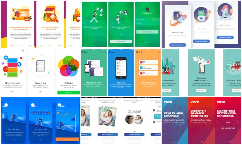
In Christopher Alexander’s A Pattern Language, Reception Welcomes You demonstrate how to design a space that displays hospitality and offers welcoming gestures. This pattern makes me think of a lot of existing apps today that have a specific brand identity. When you open a new app, you will always see an introduction or guidance that welcomes you and teaches you how to use the app. Alexander explained, “Arrange a series of welcoming things immediately inside the entrance – soft chairs, a fireplace, food, coffee.” These items and setups create opportunities for users to acquaint with the welcoming atmosphere right away before they reach the next step. Like many apps, there are particular features designed to signify these welcoming and robust gestures.


The examples of the new apps’ introductions are so clear and attractive. I can understand the term by the time I saw the image example, in just one sec!
very detailed explanation! i like the “welcome inside the entrance” idea
That’s a lot of researches on “welcome page”! The images strongly prove your view.