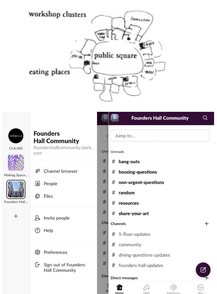
It’s interesting and surprising to connect patterns and spaces in architecture with digital interaction. These two can be cleverly matched in terms of design, as they both serve for human groups, only the space forms are different. Architect Christopher Alexander’s Patterns from A Pattern Language provides lots of design inspiration and rules for interaction designers.
#41 Work Community
Alexander emphasizes how the workplace functions as a community through some rules, which can be well reflected in Slack. First, a space that is not too scattered or too aggregated is the most efficient work environment. It is the most effective when it can accommodate 8-20 people, and 15 people are the best. This is exactly the number of the most active group chat on my Slack. Also, it is necessary to have a common piece of land to connect individual spaces, which like an office corridor. This area is also reflected obviously on Slack, which provides users with space to breathe, rest and switch. What’s more, a larger space to separate individual workspaces makes them more functional. This is like the leftmost space on Slack that looks like the main menu, which is convenient for users to distinguish and open the submenu. This makes chats on Slack more efficient than on many other social media.

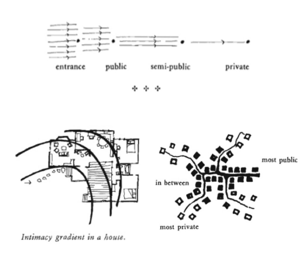
#36 Degrees of Publicness & #127 Intimacy Gradients
These two parts convey a similar but important message, emphasizing the importance of the classification of publicness/intimacy in the workspace. “Unless the space in a building are arranged in a sequence which corresponds to their degrees of privateness, the visits made by strangers, friends, clients, family, will always be a little awkward.” Instagram does a good job on this. The same applies to digital social platforms, and Instagram does a good job on this. The private account and close-friend story mode constitute the classification of publicness/intimacy very well. When users’ privacy is improved, they will naturally use the app more often and share their life more naturally. Of course, users also have the right to choose publicity, which makes the classification of information transmission more effective.


I think the example of Slack you made is really interesting. And I am really shocked that the most active chat group on it exactly 15 people.
I agree with your idea, Thank you for sharing!