Christopher Alexander describes #36 Degrees of Publicness using our personalities (introvert/extrovert) as a way of choosing where to live in a neighborhood. He states, “To make sure that the different kinds of people can find houses which satisfy their own particular desires, we suggest that each cluster of houses, and each neighborhood should have three kinds of houses…those which are nearest to the action, those which are half-way between, and those which are almost completely isolated. And, to support this pattern we need also, three distinct kinds of paths:
1. Paths along services, wide and open for activities and crowds, paths that connect activities and encourage busy through traffic.
2. Paths remote from services, narrow and twisting, to discourage through traffic, with many at right angles and dead ends.
3. Intermediate types of paths linking the most remote and quiet paths to the most central and busy ones.


FOR THE PURPOSE OF PROTECTING PERSONAL AND FRIENDS AND FAMILY INFORMATION, I’VE BLACKED-OUT THOSE AREAS
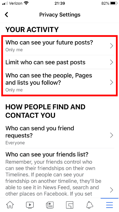
Using Facebook as an example of how this design pattern is implemented, we can start with the privacy settings. Facebook lets you choose who can see your posts which can range from everyone to friends only or even just yourself, which can relate to the introverted or extroverted personality Christopher refers to.

The first path can be represented by the “Watch” section where you can view videos from other organizations and people. This section/path is available for the public to view with a lot of traffic as you can see with this particular video with 1.6M views

The second path is described as remote, discouraging traffic. This can be represented by the “Groups” section where you affiliate yourself with certain crowds that go with your interests or association. For this example, you can see I’m part of this group called “Veteran 2 Veteran Info”. This is a private group and is only allowed to veterans or people still serving in the military. It requires proof that you served or are currently serving from the admins within this group to gain access.

The third path which connects quiet paths to busy ones would best be represented by the “Home” page. This is basically your page/feed and it bridges your house to the busy path of your friends, groups and other random pages.

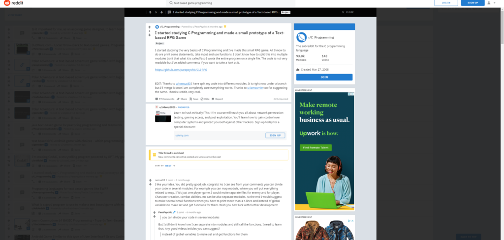
Small Meeting Rooms is another pattern he describes how “the larger meetings are, the less people get out of them” and to “Make at least 70 percent of all meeting rooms really small…Locate them in the most public parts of the building…” I thought this pattern really captures how the internet is, a massive meeting where people go but don’t get much out of it unless they pinpoint what they are seeking. I can see this concept come alive on the website known as Reddit, where people post forums/concerns and have discussions. By creating a specific question, comment, or concern, a “small meeting room” is created, attracting people who have answers or comments to your post.

Another pattern that I was interested in is Circulation Realms where he states, “in many modern building complexes the problem of disorientation is acute. People have no idea where they are, and they experience considerable mental stress as a result.” I think this resonates with a lot of websites where a lot of information is put into it and people will need to navigate within its complex in order to get where they want to be. For this, I will use Amazon as an example. Amazon has become a skyscraper with vast amounts of services from product purchasing to online video streaming. In order to navigate through its environment, the search and navigation bar on top can help guide users in the proper direction.


I like the way you used red boxes to explain the examples you are pointing out.