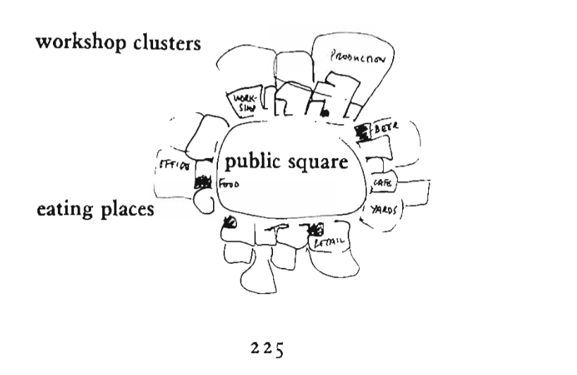
Christopher Alexander had come up with many pattern designs for communities and public spaces. The one design that really stood out to me was his work community design. Christopher thinks that if people are spending as much time living in the workspace as they are living in their homes, then the workspace should be treated as a community space too. So Christopher concluded many elements from a community into the workspace. There are cafe, little gym, little yard, office space, lunch counters, food stands, and so on public spaces in the building. And they all form a circle, surrounding a piece of core public square. This design reminds me of the Slack community which I am in right now. The similarities between these two are that they are all communities that bring people together and interact with each other, they all provide rooms or spaces for different things and they both provide public and private space for each person. The main differences between Slack and Christopher’s community are that the Slack community is a virtual community on mobile devices, Christopher’s community is a physical space in which people can really live in, and the Slack users don’t have to stay half of their day time on the virtual community but Christopher’s community workers do.

Another Christopher’s design that got my attention is his small meeting rooms. In his design, there is a room with a round table and seats that take up to 70 percent of the space. I really like the use of a round table because it is the most rational table that I can think of for space-saving and viewing presentations on the other side of the room. I was once presenting a project in a classroom and my classmates were sitting very scattered and some of them from far away couldn’t even hear my voice. And that experience really made me think that the audiences should sit together as close to one point as possible, and the round table can do that very easily.

The last design that attracted me is the structure follows social. This design is very thoughtful and perhaps philosophical because the goal of this design is to not dictate any form or fight with anything. I also believe that different people can come up with very different social ideas in this building too. This design reminds me of what happened when I first played a sandbox video game. It was fun because I have a lot of freedom on everything and the same for this design since it allows users to freely modify the spaces in the building.


Interesting examples and analysis! How did you make such clear screenshots from the reading haha I’m curious.