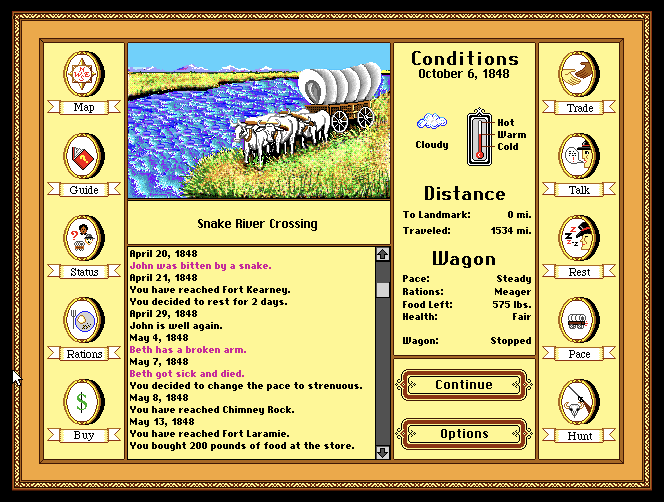
After playing Oregon Trail, this game delivers people to imagine what the 19th century was. The country background music of strings and flute makes gamers get immersed in the gameplay. Graphic elements are another key factor for the immersive experience. Icons are easy to link up with the labeled text. The overview of the status of the game are well organized. In the weather section, an image of a cloud, sun, and rain directly tells players the weather. The thermostat with three stages: Hot, Warm, Cold; let people guess the temperature instead of having it in numbers. The log of travel data indicates the incidents in different colors: pink implies fatigue or injury. I find the indication using color helpful in a game as I can feedback on the event.

I really should replay the game, for I totally didn’t take a close observation on the elements that represent the weather and temperature,
I agree with the color choices The Oregon Trail made. That yellow color is very on brand for the time this game was made.
I was super into the visuals as well, I think it’s perfect for the setting they wanted to create. I bet for the time this was insane. It also reminds me of today’s Stardew Valley and it’s 8-bit style rendering.
I also thought the 1992 version did a better job at the interface than the 1990 version. There was less typing and more clicking with the mouse, which can significantly reduce time typing on the keyboard.