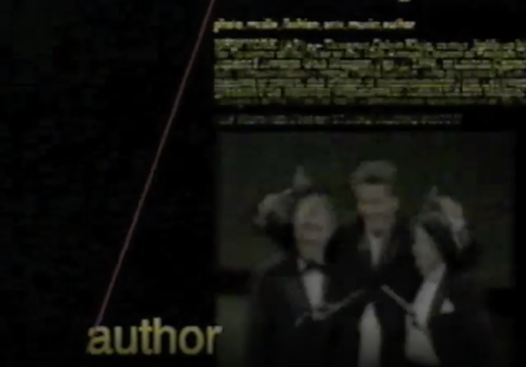
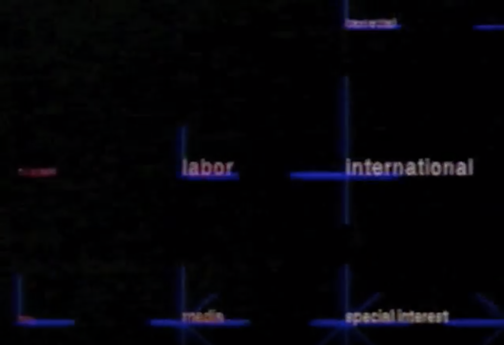
In Christopher Alexander’s patterns, the subjects of these patterns are oftentimes people, in groups, with categorizations, in communities, all connected and inter-networked. In the demo reel on Information landscapes, the subjects are mostly content and textually conveyed ideas, in groups, with categorizations, in larger systems, all connected and inter-networked. Aside from this clear commonality in structure, I found many other similarities in both the patterns and the demo reel such as their shared tendency for categorizing or grouping subjects with distinct labeling and intent. In the demo, this is realized as text headers that open into subcategories to narrow down searches and find content as it does this still below taken from the demo.

Whereas in the patterns we can read Alexander proposes different ways to situate communities, while including a common area, and even something called “the flow through rooms”. These, in a virtual setting, could be the main dashboards or search engines which all other information is linked to in a system that is interconnected and active with possibility.
In Alexander’s pattern #8 talking on Subcategories and the divisions of communities, he included a sketch that is similar to the concepts proposed in the demo reel. The communities are divided and categorized, each with common places, businesses, and homes inside of them. We can this idea within informational architecture as well.
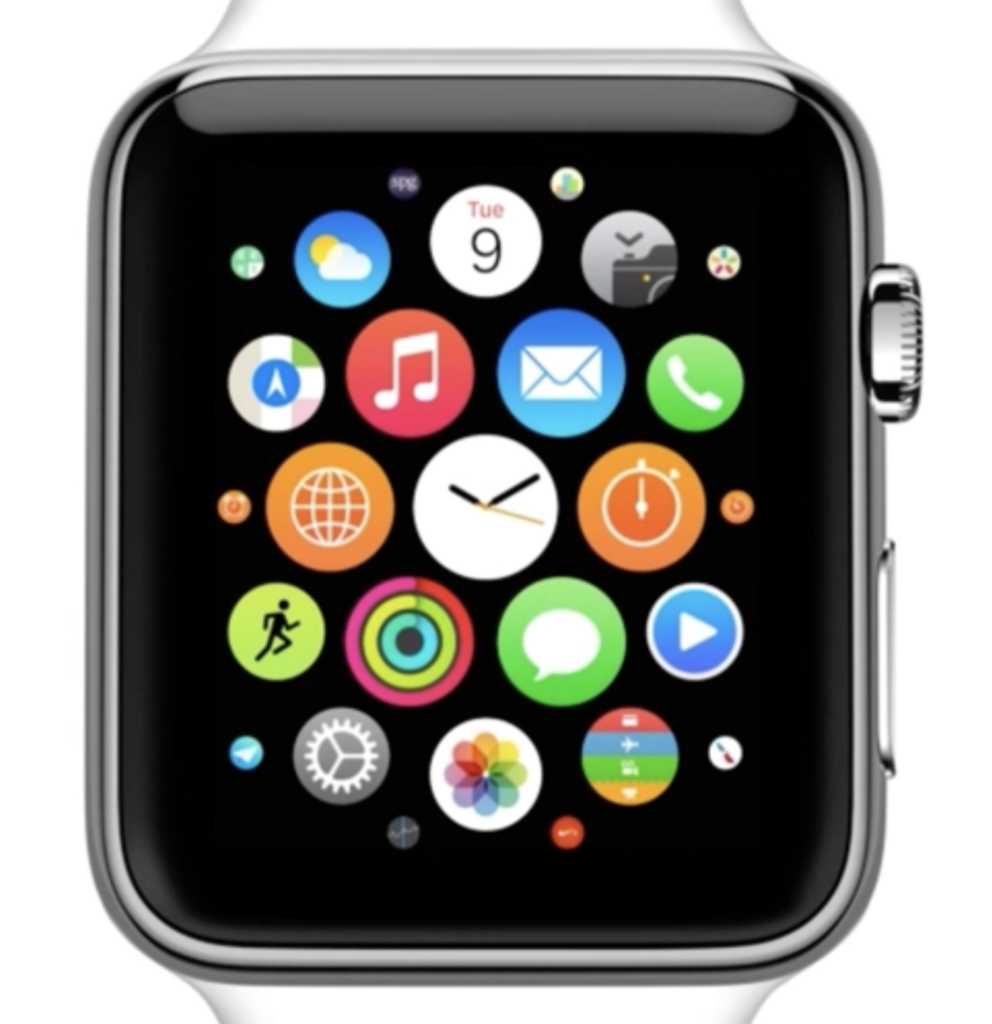
Something I noticed In the demo was that all the information was visible, or layered over each other. This is very different from the applications and software visual design we use now. Instead we have very simple systems of navigation and oftentimes a network of screens that have a similar concept as the demo, however are much easier to comprehend and use by someone who may not have enough time to figure the controls out. We still do not have as much universal 3 dimensional visual interfaces that allow for some of the complex movement shown on the Demo. However we are beginning to create them with technology such as Augmented Reality. There was a scene where the demo was navigating between different headlines to search for information. This way of navigating reminded me of the apple watch app home screen, where the app icons are set up and animated in a very similar way.


