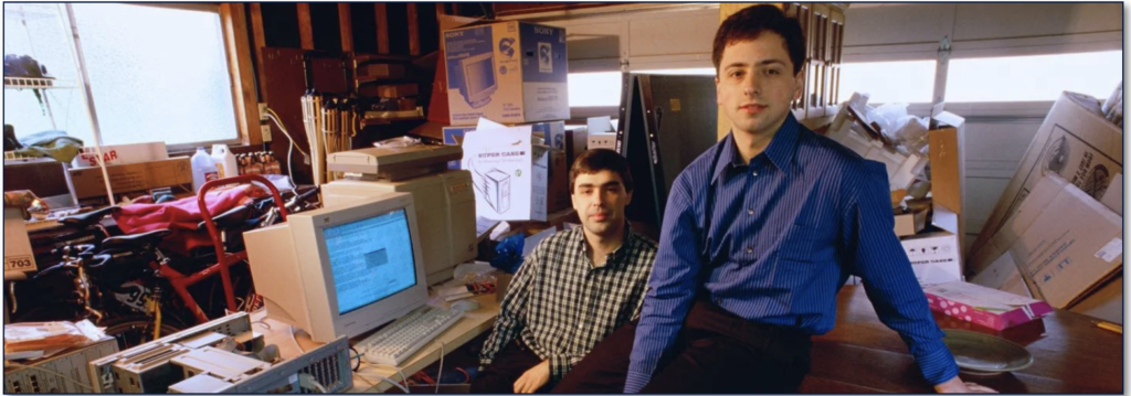
Larry Page and Sergey Brin, two computer science graduate students, met at Stanford in 1995 and created what would become one of the most useful inventions of all-time — a highly usable and accurate internet search engine.
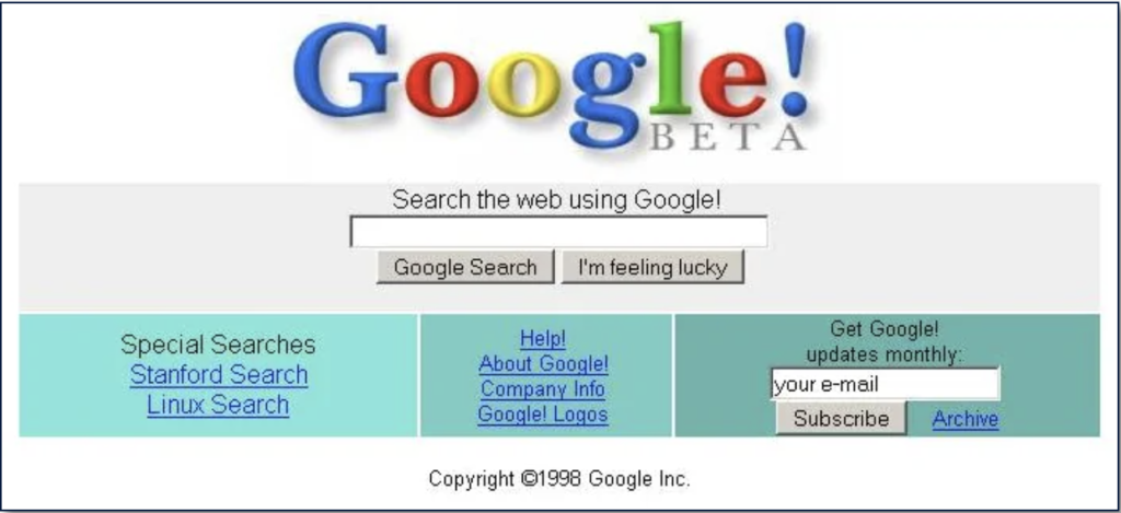
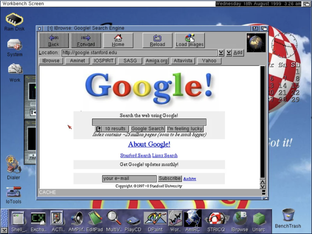
In 1998, Google’s branding began to take form, progressing from the wacky older logo above (and others) into a design created by Sergey Brin in the open source image editor GIMP. This logo showcased the hallmark primary color scheme still very much in use today. But naturally, the exclamation point at the end sticks out like a sore thumb. It seems trite now, but surely Google at the time was inspired by their fellow Bay area internet pioneers at Yahoo!. In addition, the “I’m feeling lucky” button is added, which automatically redirects the user’s browser to the first search result when pressed. Though the button still exists, it’s essentially just for show with the transition to Google Instant in 2010.
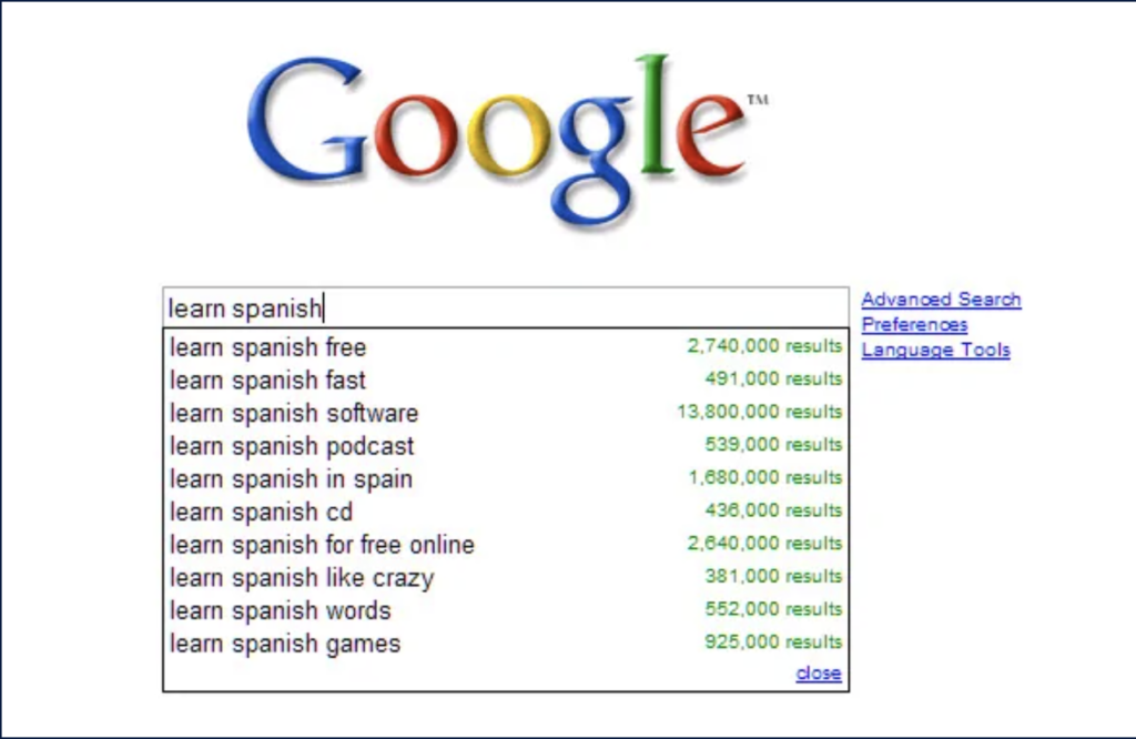
Google Suggest started off as a test product in the now-defunct Google Labs. (Labs was a part of Google’s site that showcased experimental and novel features for public consumption. Some of these experiments made it into real Google products, and others were discarded.) In August 2008, Google Suggest was promoted out of Labs and launched to the masses, allowing potential search terms to magically fill-in in anticipation of what the user typed. This feature provides a lens into the universe of search terms people type in, and thus, has inspired several books. Google Suggest was a precursor to Google Instant, launched in 2010.
In 2018, Google’s homepage become more clean and simple. The homepage has appeared mostly the same since 2011, except for the new logo.
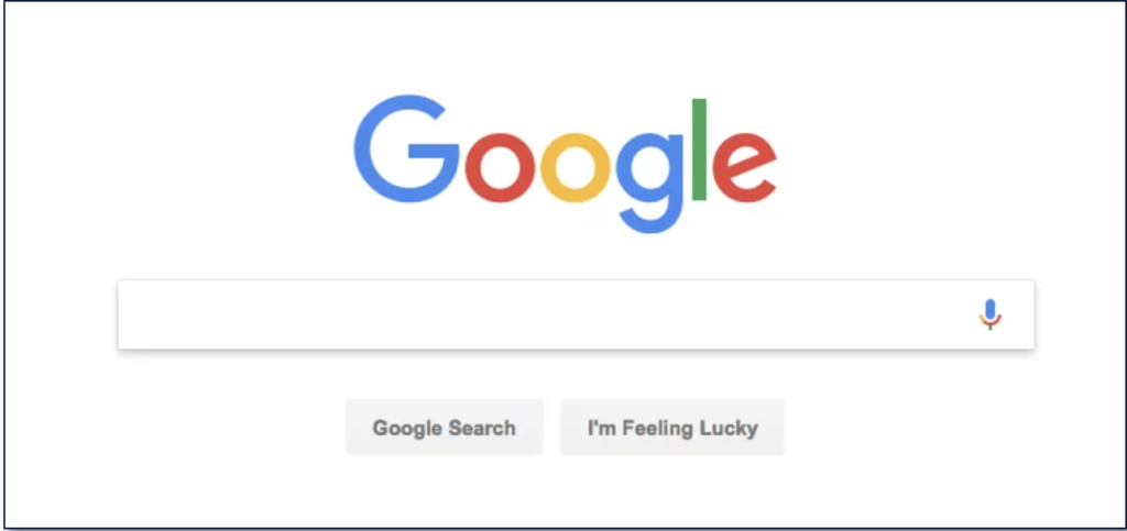
Google constantly improve upon the usability and design of its search-based offerings. This means cleaning up a UI when needed, and launching new features that serve up that much-lauded universal accessibility in short order. What may come across as a small box centered in a vast expanse of white is, as you’ll see, actually something that’s constantly evolved since ’98.
Source:
Abraham, Priya. “A Look at The History of Google and How It Was Founded.” ZNetLive Blog – A Guide to Domains, Web Hosting & Cloud Computing, 11 Apr. 2018, www.znetlive.com/blog/a-look-at-the-history-of-google-and-how-it-was-founded/.
“Google Search: A Visual History.” Engadget, www.engadget.com/2014-04-26-google-search-a-visual-history.html.
“How Did Google’s First Web UI Look like? – Quora.” Www.Quora.com, www.quora.com/How-did-Googles-first-web-UI-look-like. Accessed 18 Nov. 2020.

It’s so interesting to see how the “I’m feeling lucky” button has persisted after all these years. It’s truly iconic, and shows us how we can honor legacy over pure functionality.
Nice thorough explanation of Google and it’s good to see their classic colourful logo throughout the 20 years.
It’s so reminiscent to see their early version of the interfaces!