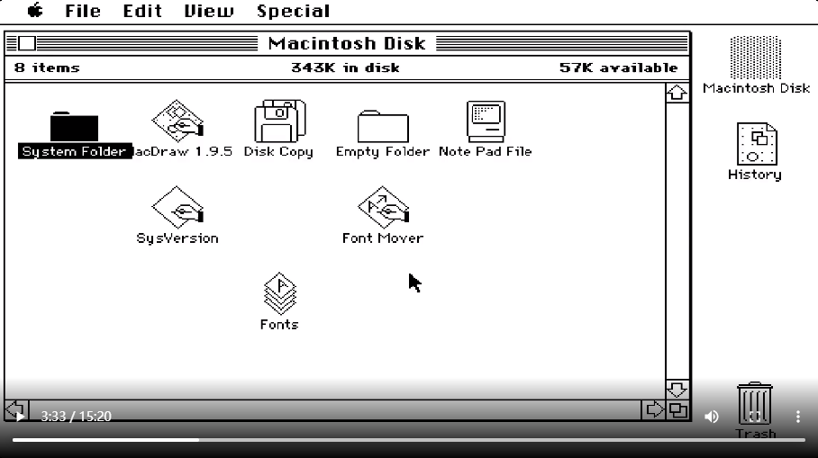
The state of UI design is always in progress. From its 40 year history, designers have been making updates. Of course, that doesn’t mean everything has to change. Each UI element and function has its own meaning of existence, and all updates and retentions are for a better experience for users.
After watching demos of Xerox Star in 1892 and Macintosh in 1894, I was surprised to find that many of the features and UI elements in use today has already existed at that time. For example, the computer desktop, files, folders, trash, windows, control panels, and other functions such as copy and paste, print, draw, change fonts, and even some simple games.
Of course, there are many elements that have been updated. The first thing I noticed was the connection between hardware and software. For example, the most popular three-button mouse now has a middle wheel, which makes it easy for users to slide through long content. Many functions, such as moving desktop icons, can now be done directly by using mouse buttons, rather than requiring a second confirmation from the keyboard. What’s more, keyboard shortcuts can now do the same thing as clicking function buttons.

The change in the icon is also obvious. First, icons are simpler in style and smaller in size. Now, the file names are displayed at the bottom of the file, not on the icon, which solves the problem of too many words and color conflict. In addition, due to the popularity of color in the computer, the selected state of the icon is no longer black, but a translucent white square appears on the periphery, which can be applied to any color of icon and desktop background.

Hierarchy is also an important change. In the demo of Macintosh, the presenter, from a contemporary perspective, mentions an observation that there is no hierarchy of files in the folder. The files in the current folder are sorted in alphabetic order by default, and hierarchical sorting will be realized according to the order of “secondary folder” – “file” – “picture”. As Stewart Brand says in “Pace Layering: How Complex Systems Learn and Keep Learning”, the importance of layering is reflected in civilization, but it is also in interaction design.


Glad you mention the Hierarchy improvement!
Thank you for sharing! that’s very interesting, good to see you mentioned the connection between the hard and software.
very clear explanation! happy to see you mentioned the connection between the hard and software