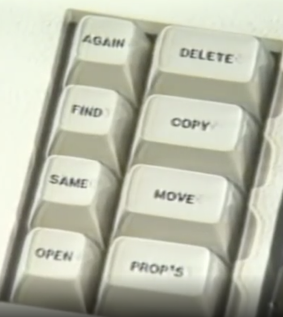
Looking at the graphical user interfaces of the Xerox Star (1982) and the Macintosh (1984) and comparing them to modern computers and devices, we can see what has changed and what has remained largely the same.The first thing that has changed is the computer keyboard.


We can see designers simplify the keyboard by removing some functions like “open,” “move.” We can use the mouse to open or move the files instead of using the keyboard today.
The second thing that has changed is Multitasking. In the demo, the user explained that he could only run a few programs at once, but today, we can open and run more programs at the same time.

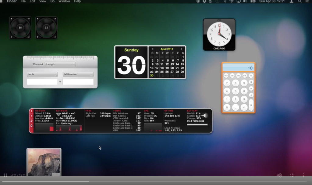
The design pattern of Apple doesn’t change a lot. The menu bar is nearly the same as before.


The desk kits are still here.


And we can still open the finder in the menu bar.


You provide several examples, that’s really helpful for me to understand your idea. Thank you for your sharing!