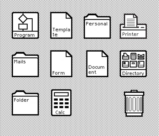
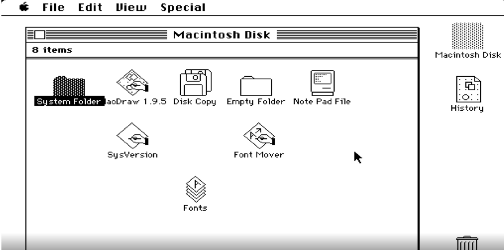
Looking back now, it’s just a built-in bundle software with simple features, but this program was a simple tool to utilize best Xerox Star and Macintosh, which had nothing in its early days. Within the Macintosh system had calculators, calendars, note pads, simple word processing, and simple picture plates. Functionally, it was a basic word processor enough to change font type, size, style, and add pictures in addition to letters uses only black and white to show icons of consistent and simple styles within a square grid.


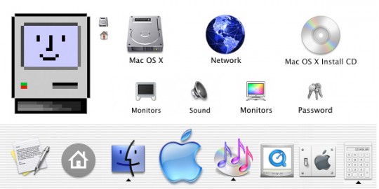
Entering the 2000s, Icons became more realistic. In 2001, Mac OS’s icons were able to express smooth boundaries and curves and showed deeper icons by applying transparency and shadow. Therefore the icon’s quality has developed into a sophisticated look like a picture.


Since then, the style of icons has changed continually depending on the device’s size and resolution. Flat-style icons that eliminate gradations, shadows, and minimize dotted lines rather than a detailed representation of objects. Rather than filling in more and drawing more, this method delivered the meaning faster and easier with a concise look.

/cdn.vox-cdn.com/uploads/chorus_asset/file/19733303/windows10newicons.png)
