Looking at the graphical user interface for the Xerox Star (1982) and the Macintosh (1984) and comparing it to modern day computers and devices, we can see what aspects changed and which stayed pretty much the same. First, we need to understand that the Xerox Star was designed for office professionals which handled storage, transfer and printing capabilities for files/documents and be able to communicate with one another through servers and email. The Macintosh, introduced a couple years later was designed to do more than the Xerox Star’s file handling capabilities which included things such as image manipulation, 3D modeling and playing video games.
Things I’ve noticed with changes include methods of executing commands (like copying and printing a document), multitasking and creating hierarchy for files and directories.

On the Xerox Star, in order to move a document from one place on the screen to another location on the same screen, you would need to click on the file, press “Move” on the keyboard and then click where you want the file to move to with the mouse. Today, you can simply click, hold and drag the file with the mouse with no keyboard interaction.
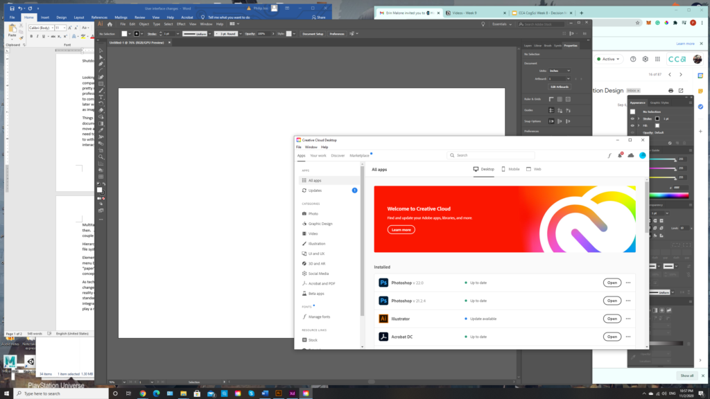
Multitasking is a huge modification as computer processing capabilities increased in performance. As we saw with the demo from the Macintosh video, the user explains how you can only run a couple programs at once but today, you can have a lot more programs opened and running at once.
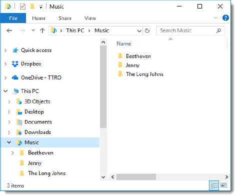
Hierarchy of folders and directories is another change that we gladly see today as opposed to the single file system or “one-level/plane” design we saw in the Macintosh.
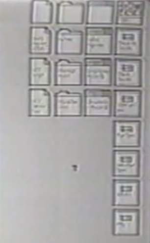

Elements that stayed the same or had minor are the icons used to display programs & files and the menu bar that is displayed on the top for Mac computers. Documents will be represented with a “paper” icon. Folders are represented with file folders we see in a business setting. Although the concept of the menu bar hasn’t changed, we do see minor changes by adding icons on the top right side.
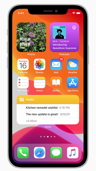

As technology evolves with increasing performance and capabilities, we will continue to see various changes as to how we interact with technology. We can see this with mobile devices, virtual reality equipment, and augmented reality. The keyboard and mouse I/O devices are pretty standard when it comes to interacting with desktop computers but these days computers can be integrated with mobile devices including watches and glasses (Smartwatches and glasses). Widgets also play a role on how information is displayed on these devices.

interesting observations and thoughts! I like you mention the “drag and drop” feature in modern interactive interfaces.
It is interesting to see the difference!