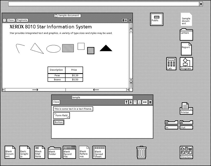
The Xerox Star, the pioneer of the graphical digital interface, which was introduced in 1982, had shown lots of similarities compared to today’s UI. Lots of important UI design principles were developed based on the creation of Xerox Star and the first generation of the Macintosh.
The idea of signifier, affordance, and feedback was demonstrated in those systems. When a document is selected, the color will change to black to indicate the only selected documents – the feedback. In today’s UI development, the color and lines will appear if we click on the folder once. Also, in the Xerox Star, each document file was comprised of an icon and descriptive texts. Each icon represented the type of the document or program, while the texts show the name of the file. We keep the same concept in modern designs because it is crucial to let users know what entities are shown on the desktop.
Moreover, the buttons were clear to know it was clickable because it had an outline with an opposite color inside. That’s the affordance. Also, the location of the buttons showed the importance of proximity, from the gestalt principle. The example from the picture shows that the display option buttons are closed to each other, while the functional buttons(“close”, “paginate”, “?”)are grouped on the left. The arrows at the bottom are the same size and style. Those give users a clear understanding of which section of buttons is responsible for what kind of actions.
One of the obvious difference in today’s computer system is that, we use the combination of keys to execute commands, such as copy, paste or redo. Therefore, unlike the Xerox Star, the modern PC/laptop save spaces for the keyboards since we no longer need certain keys for these commands.

The button in the past also built based on some portions of the gestalt principle, such as proximity, hierarchy, and grid. For example, in the Macintosh 1984, the idea of information hierarchy was presented by the design of the top menu bar. After clicking the word in the top menu bar, users would find sub-options to select. Today, Mac keeps the same basic rules for the top menu bar. The overall arrangement of content also showed the application of the grid obviously. The white space between the documents was evenly distributed.

In the future, new ways of interacting with technologies will build based on those design principles such as proximity, signifier, affordance, and so on. I think those basic principles will be kept, but what will change is that the new forms of signifier, affordances, and feedback.

Thank you for mentioning the location of the buttons. Also, I didn’t notice the clickable feeling the button provided was the outline with an opposite color inside. Great affordance!
I thought it was funny how they had a button for moving and copying! I think they were so used to building physical interfaces that it was easier to add the function as a button vs programming it.