In Relation to Ancient Egyptian Hieroglyphs
With the development of mass media, the icons of applications are
With the development of mass media, the icons of applications are becoming more and more similar. The main reason is that designers should make sure that they don’t misunderstand users. However, in recent years, some new applications with more personality have begun to pursue a more personalized icon design which is more in line with their core values.

Influenced by the Japanese “Otaku
Influenced by the Japanese “Otaku culture“, bilibili’s early stage was a video website for ACG (animation, comics, games) content creation and sharing. After more than ten years of development, it has covered more than 7000 multi-cultural communities of interest circles, and is now a cultural community and video platform highly gathered by the young generation in China. In order to accommodate new users and keep old users, bilibili adheres to its previous personality style. Colorful, kawaii icons seem to have become its interface features. That’s why bilibili has been able to capture young users.
It is worth discussing whether these personalized icons are efficient in information transmission. As they may cause ambiguity to the user, designers must indicate the meaning with text under the icon.
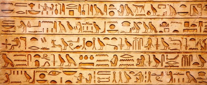
The form of these icons can be found in ancient Egyptian hieroglyphs about

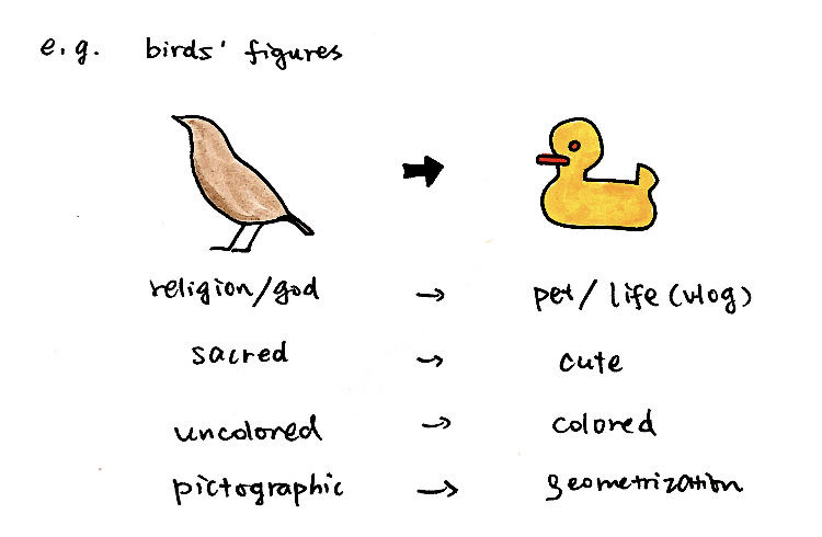
The form of these icons can be found in ancient Egyptian hieroglyphs about 5000 years ago. One of the artistic characteristics of ancient Egypt is that the figures are relatively rigid, and their hieroglyphs can also be reflected. Clear and simple characteristics make communication more efficient. This is also true of the trend of flattening in the 21st century. It’s just that they’re given a different meaning by different cultures and times.

Another prominent feature of bilibili’s icon is the use of color. Influenced by the writing materials, most ancient Egyptian hieroglyphs were colorless. Today, we label different colors as different vibes, which is a progress of visual communication, while the application degree of color should be determined according to the application style.

I agree with your idea !Thank you for your sharing about the relationship between Bilibili Iconography and Ancient Egyptian Hieroglyphs.
Thank you for your sharing about the relationship between Bilibili Iconography and Ancient Egyptian Hieroglyphs. Your cute sketch helps me to understand your context better.
Thanks for doing the cute skechnotes! They helped me to understand your context better.
I really like your sketchnotes which is cute, and also very interested seeing how icons changes since the Egypt to now on.
It’s so nice how icons and pictographs of today are free to be as fun and creative as the artist wants them to be! Egyptian hieroglyphs were essentially a written language so it makes sense they would have to be more rigid and constrained like letters, but it would be very cool to see fun, cute hieroglyph “typefaces” that are entirely in the Bilibili style.
I think the hieroglyphics were colorless when carved into stone, but not when they were drawn and painted on papyrus—so color may have been an important factor for understanding in that medium as well.
Love your sketchnote! It wroks great for comparision.