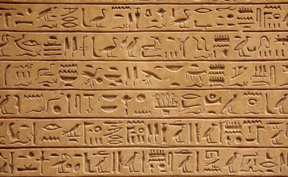
Hieroglyphics evolved from pictorial writing, and it is one of the oldest fonts in the world. Unlike phonograms, hieroglyphs are ideograms. Egyptian hieroglyphs were independently produced from the most detailed pictures and patterns of primitive society. Since the use of logos in hieroglyphs in ancient Egyptian civilization, icons have become a norm (Davies,1958). In modern times, there are many mobile app icon designs inspired by Egyptian hieroglyphs. Because icon design is not only one of the essential elements in mobile phone interface design, a set of high-quality icons can also improve the popularity of mobile phone application interfaces, reduce user understanding costs, and help to shape the brand image, improve user security and conversion rate. Therefore, this study will take Egyptian hieroglyphs as an example to discuss and compare the mobile phone application icon design and hieroglyphs, and further analyze what these graphic designs convey? What is the metaphor among those icons?
The various symbols expressed in Egyptian hieroglyphs are similar to the icon designs of many new mobile applications, but they convey different contents and meanings. Some apps’ icon design uses Egyptian hieroglyphic graphics, but the meaning and metaphors are not the same. Specifically, most of today’s mobile phone icons are designed to provide users with concise and precise information and operations to be performed; most Egyptian hieroglyphs express intentions and emotions without specific concepts (James,2010).
I wanted to use the famous Chinese social app WEIBO as an example, we can found different icons that guide users to find related content. The icon design of WEIBO’s is at the bottom of the page, and it is also shown in the figure below; the user can see five different icons, all with Chinese annotations listed below these icons.
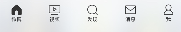
It is easier for users to find icons and instructions at first glance when opening the application. In terms of its function, we can find that these icons have very clear directivity. For instance, the first icon below the WEIBO page is similar to a house representing the homepage, and a magnifying glass icon directs the user to use the key to search for information. A human-shaped icon design represents the user themselves in the interface, and the user can enter the personal homepage of the social media by clicking the icon. In general, the graphic design in these modern mobile apps conveys straightforward content and a simple design idea. For those who do not use WEIBO at all, it is easy for them to access other content by understanding the icons’ interpretation in the app. However, there are not many real phonographs in Egyptian hieroglyphs, and most of them borrow the pronunciation of several phonographs to express the concepts. In Egyptian hieroglyphs, the table shape and ideogram are combined, and more importantly, most of them still maintain separate graphic characters. For the metaphors of icon meaning, the information conveyed by mobile app icon design is more simplified and easier to understand.
Besides, many Egyptian hieroglyphs are used in the engraving of inscriptions. At the same time, hieroglyphs are widely used in taxation, and other data records related to economic development and administrative management filed, and even the memorials of royal achievements, religious content, descriptions of witchcraft spells and rituals. It is easy for us to find eight different symbols through this picture below; each symbol has a different meaning.
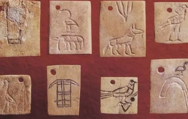
Some are used to indicate numerical values, some are used to indicate the exact geographical location (the place represented by the symbol may be the origin of the thing represented by its glyph), and some are related to the administrative actions.

By comparing with the Twitter icon design, we can find that each of the Egyptian hieroglyphic designs represents a specific event or content direction( Sharpe, S. and Bailey, C,1861). However, the icon design of many mobile apps is more freehand and creative. For example, in the Twitter app icon design, we can see a bluebird in the center of the icon, and the bird’s head is raised, the wings and feathers are divided into three segments. The icon consists of three overlapping circles representing the unity of users, interests, ideas, and the intersection of friends. The icon design conveys the meaning “Twitter is the bird, and the bird is Twitter”.
To sum up, by comparing and studying Egyptian hieroglyphs and the mobile app icons’ design, we can learn the importance of making new and expressive icons. For example, in the design comparison of hieroglyphs and WEIBO icons, some hieroglyphs can only understand the meaning by reading the text. Nevertheless, mobile app icons with precise meanings are more comfortable helping people understand the icons’ concepts and complete the corresponding operations.


Your comparisons are stronger when you stick to one topic. Adding in the Twitter icon comparison at the end feels like a dilution of your main point and takes away from the message of the previous paragraphs
I agree on that the icons should be direct and entitled to human’s common knowledge.