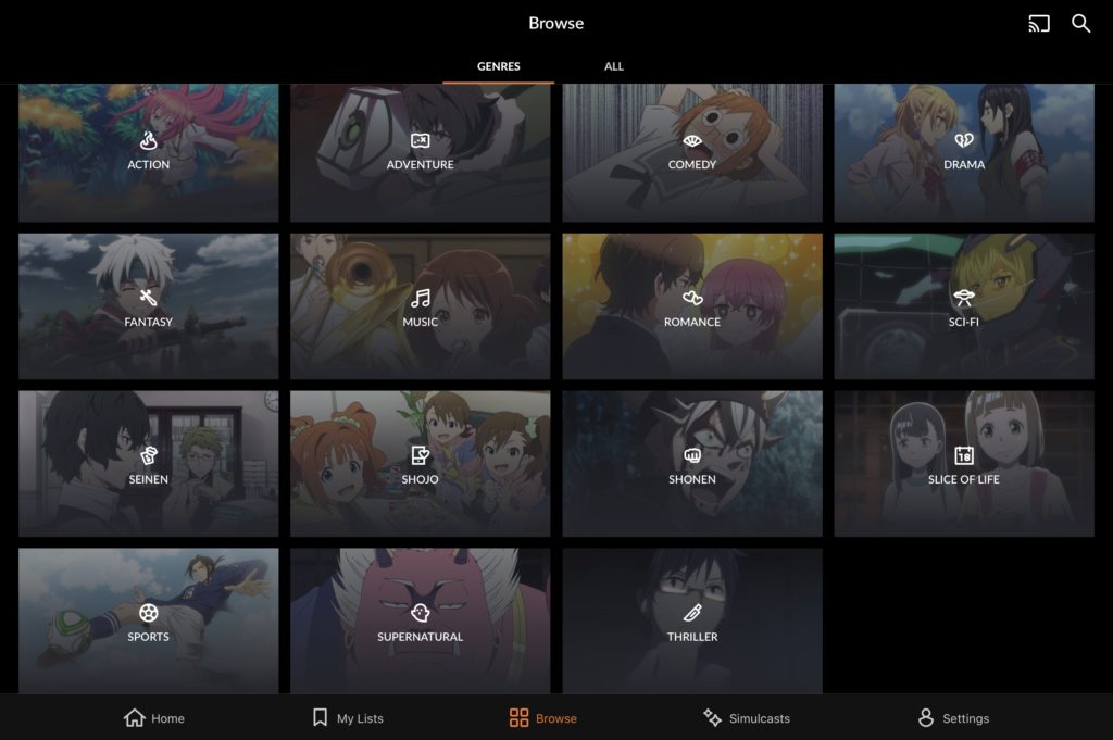
Crunchyroll is an anime streaming app. I chose Crunchyroll because they use symbols to represent the various genres of shows that they offer which are different from that of any other streaming service I’ve seen. The action genre is represented by a symbol of fire because of the heated battles and intense journey’s. Romance uses two small hearts to represent the themes of love that are overly represented in the selections. I believe these symbols make sense and are accurate to what they represent but I’m not sure they are strong enough to be used without words underneath them. For this example the symbols are readable and they look well designed but they don’t offer the same level of understanding as say, three vertically aligned dots for a menu, or a symbol of a gear for settings because they are more commonly used. The required understanding for Crunchyroll’s genre menu is too high which is probably why they placed the title of the genre below the symbols.
Considering the Sumerian Alphabet, it’s easy to notice that they use just lines and triangles and this is probably because whatever tools they used to write limited what characters they could come up with. This limitation of design by the tools used is probably what made their symbols as powerful as they are. If I hide the translation all my guesses of each cuneiform symbol was wrong, however the fact that I can get close or get some kind of guess, to me, shows it’s effectiveness. As this language develops and becomes less symboled and more “chicken feet looking” it becomes more typographic and requires more understanding of the language itself and the cultural references of the time to be readable. The development of the Sumerian alphabet is similar to the development of symbols and icons we use today. As our tools advanced so did our metaphors and as society advanced so did the symbols we use to represent them.


Hi Corey,
I think its a great point that the Sumerian alphabet primarily being comprised of triangles and lines is a reflection of their availability of tools and resources. Its also worth noting that the increasing complexity of the written language reflects the evolving nature of conveying complex ideas and concepts. Interestingly enough, the visual complexity in the Sumerian alphabet contrasts with the ever-growing simplicity of today’s icons, and yet the icons of today are a result of a complex history in visual communication.
Some of the icons are definitely too metaphorical and vague to stand on their own. The fire symbol for the ‘Action’ genre could mean anything in any other context, which is why icons with pre-learned meanings turn out to be so much more effective.
I chose them as my icons because I started to notice there is no reason in them existing in the first place but I love that they do anyway. I considered that maybe the effectiveness is in the marketing of the visual appeal is gives? We have symbols with more purpose too but it’s cool that in our time we have the means to have useless symbols for our enjoyment.
Agreed that many of the Crunchyroll icons are too ambiguous to understand without words. Because they are unique to this site it makes sense versus iconography that is used across multiple apps and sites and have developed a cultural understanding around – much like the cuneiform being understood in it’s time and place.
I thought a lot about the evolution of the written language. I think seeing the overall developement was really interesting, I haven’t really considered the evolution of even written English that often because I’m so used to it I guess. Also, being that the symbols in the Sumerian alphabet evolved into lines and shapes I also wondered if maybe math had anything to do with it’s representation? I couldn’t really find anything about it.
I also love Crunchyroll and I agree with you that the symbols might not strong enough to be used without words underneath, especially for new users who might need time to memorize them. Also I think the designer is clever to add bg picture under symbols and words, which is a good way to strengthen user’s understanding of icons.
Yeah I totally agree, overall I feel like it looks great and the UI is great too! When I sat and looked at it I was kinda like, “ok but why are there icons if they aren’t really being used??”