Elevate is a mobile application for brain training. Despite, its elegant design, the app delivers a great user experience. One great aspect of design is iconography.
First, it is important to look at the objective of the application, which is brain training. Then the target audience of the application, which is normal people, who wants to stay sharp, productive and confident. The nature of the app results in a heavy use of iconography with minimal texts as discussed in the lecture.

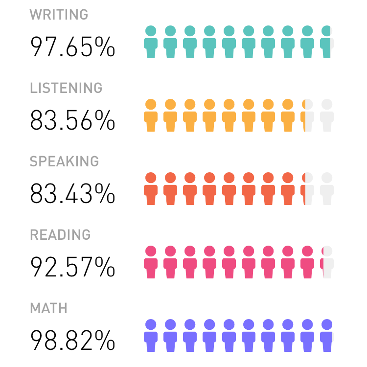
The use of iconography in each section depends on the information type that designer wants to communicate with the user. For instance, in the performance section above. Designer users data to show progress and where the user is compare to others. In addition to that, the human icon resemble the Egyptian hieroglyphic, the human shape, but with different meaning. The context here is to convey the progress. Designer uses filled and unfilled stage and numeric as an indication.

Designer uses pictograph to illustrate the user achievement earned in the achievement section. These icons are similar to Mayan pictographs with complex shapes. Although, it is a tool for communication, the context and intention make the design looks and feel different. Here, designer uses the achievement icons as an incentive to make the user feels accomplished. It is a psychology factor that is used in games and learning tools.
To sum up, there are similarities and differences in iconography due to time and purposes. At the same time, there are standard icons like Material Icon by Google. Uniform addresses the confusion or misinterpretation. This backs up Jacobs’s point on “our ancestors seem to have been curiously consistent with the symbols they used.” written by Josh Jones on Open Culture article.

Interesting analysis – how do you think color is affecting or supporting the iconographic use?
In this context (game), color can convey a powerful meaning. The performance section, designer uses a color to indicate progress between light grey and filled color. Moreover, the use of color is consistent through out the game. It gives a great feeling nice, clean and concise. The achievement section, designer uses the same principle to show progress with the change in color from light grey to dark brown and eventually colorful one. Despite indicating progress, it gives out an incentive to work a bit harder. It gives out a feeling like you are almost there. With that, the designer creates an excitement that we all want to experience in the game. There is no doubt that the app is one of Apple Editor’s Choice.
I agree with what you said about it (icon) is a tool for communication. One well-designed can summarize a lot of stuff at once – the mood, the tone, and the message.