Pictographic language was developed across different cultures from the 31 century bc and slowly evolves to a full writing system. Now, with the developments of smartphones and other devices UI icons appears to be symbols that communicates just like pictographs. I choose an app from my phone named Health and find some interesting similarities and differences between those icons and pictographs .
Health from iphone is a easy and comprehensive way for smartphone users to view and manage their health data from different sources. Health uses a lot of icons to help indicates different health categories. For example:

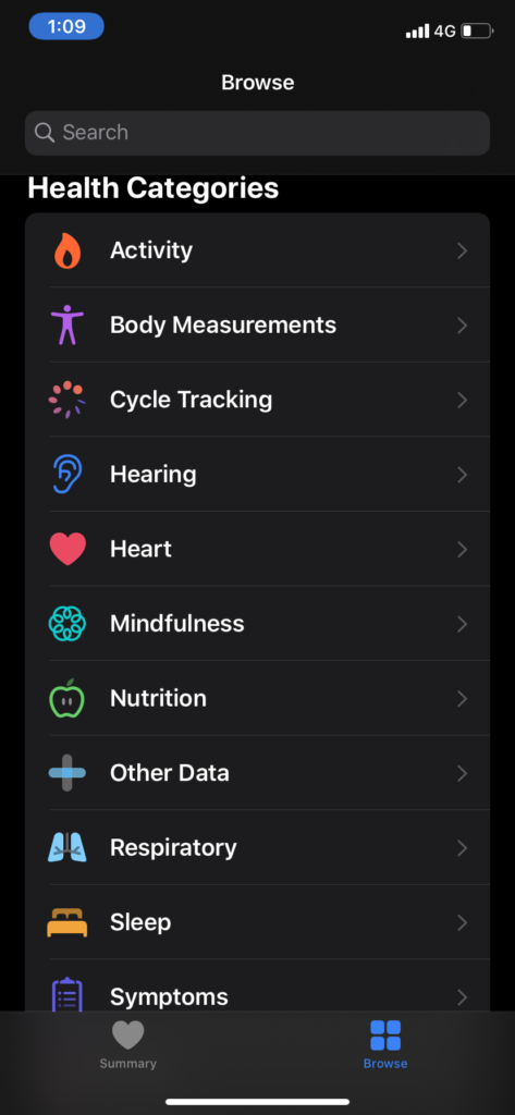
this is a screenshot of Health’s Browser, each category is indicated with a colored icon. Hearing is indicated by a blue ear. Body measurements (includes body fat percentage, weight, height, etc.) is indicated with a purple figure; The little purple human figure reminds me of those human figures from Egyptian hieroglyphics. But a huge difference is how culture and beliefs could influence the form of a pictographic: Egyptian hieroglyphics maintains their hierarchy systems even in their pictographic.

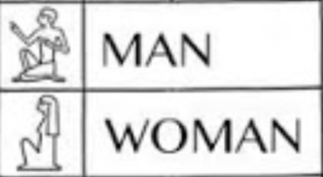
I found those pictographic on a Egyptian hieroglyphics chart. On the top: a keeling figure with only a pants on indicates man looking up; likewise the bottom: long hair, body cover in cloth sitting figure indicates woman in oder to show their respect to their king whereas kings are either standing or sitting on a chair looking down.
Now when icons are being created we as designers tend to be very aware to not bring in our personal judgments and cultural traditions’ influence on the icon itself, but to hope to create icons that’s free of prejudice.

The Egyptian definitely shows assumed gender and hierarchy in their use where the Health app uses a generic body figure which could apply to any type of person. Good analysis overall. Check your spelling and grammar—there are some typos here.
This reminds me that I used the icons of short hair and long hair to distinguish gender first, but my friend asked me why hairstyles can distinguish gender. I suddenly realized that icons also need to consider prejudice and stereotypes. I feel that icon designers are also leading the culture of the times.
Your end allows me to realize that the concept or the design is not just about individual views or feelings.
Great thoughts about the changing of designing logographs in terms of personal judgments and prejudice.