In the history of human civilization, the use of hieroglyphics can be counted as a tremendous discovery of the human race. It can be traced back to the time when the human was originally evolved from apes. In the past, the idea of hieroglyphics served as symbols, which was an essential way to communicate with one another much easier. Those symbols were mostly documented in greyscales, complex forms, and artistic look.
In contemporary society, languages, digital platforms are developed as technology is evolved. Iconography was introduced to people as a crucial design element in both the digital design world and the physical world. It not only serves as symbols but also signifiers, clickable entrances to other pages, and a method to distinguish different categories. Those so-called icons are simpler to recognize and remember, hued with various color palettes to demonstrate different vibes, as well as performed with different visualized styles in order to apply to different circumstances.
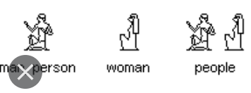
In this post, I’d like to compare the icons to express people, male and female between ancient times and nowadays. In the ancient Egyptian period, people use complex, detailed, and fused elements to distinguish sexuality, and the singularity or plurality. As we can see, the constructing shape of the male person is much more complicated than the female one. In addition, the body form is different. The male figure is presented with arms, details, and a posture; while the woman is only shown with lines and long hairs. Gender equality was gradually brought to people’s attention as an important issue in the past. However, in the earlier ancient time, the man had been seen a higher role than women. Lots of historical documentaries included the use of Egyptian hieroglyphics has supported the gender inequality idea in the past.


In modern society, gender inequality is no longer an issue in most places in the world. In the design aspect, the use of iconography to distinguish sexuality and people is simpler, general, and easy to recognize and remember. The three icons are from a prevalent social app in China – WeChat. The designer uses color, and hair length, and the use of lines to represent male, female, and people. The people icon also works as an important signifier to users as shown by the change of color.


Interesting point, I never thought about this before, now I kind of see the unfairness between the 2 icons. And I noticed that when they created statue men are always with more details than women.
I think it is important to consider whether gendered iconography contributes to issues regarding gender norms and conformity, especially since the essence of an icon is recognizability, and that makes me wonder if it inevitably manifests as stereotype? Even in the example you gave, the icon for women is pinkish and with longer hair while the icon for men is blue and has short hair, both of which lead to preconceived expectations.
Your analysis and comparisons are interesting. I don’t think you need everything in the first two paragraphs to make your point.