Our ancestors created the writing system by inventing diverse techniques like drawings, symbols, and logograms. The purpose of innovating these fascinating methods was for our ancestors to vividly document our stories and communicate in a better and more proficient way. Whether it’s Egyptian hieroglyphics, Mayan pictographs, or Chinese calligraphy, the outcome of each writing system might be completely different than others. However, they all shared a cohesive process of creating these writing systems by using – iconography.
Iconography was one of the fundamental ways for early civilizations to convey and depict the context of events or subjects. From the most ancient Lascaux cave paintings and Egyptian hieroglyphics to today’s photography, the essence of “making pictures” is an important aspect of our human creativity.
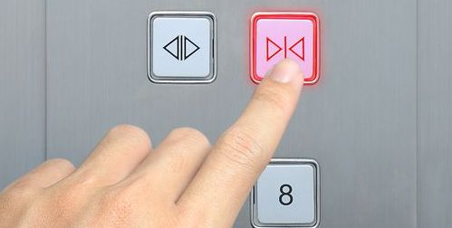
Today, iconography plays a huge role in our daily lives. In fact, we are so innate to recognize and understand icons easily that iconography exists in every corner of our world. Imagine yourself walking into an elevator in a foreign country, and presumptively, it would take you one second to figure out which button is “closing door” and which one is “opening door” because today, icons are designed to be easily understood and it “speaks” its own universal language.

Another example that iconography is part of our daily life is that our phone apps – they are inseparable with icons. From the app’s logo to the icons that are in the app, designers usually spend a decent amount of time to craft these important elements. Designers have to consider the cohesiveness of all of the icons as well as their accurate interpretations. Moreover, One of the key aspects of designing a sophisticated icon is to simplify its form without bewilder the users.
iPhone’s photo editing feature demonstrates the craftsmanship for cohesive and simplified icons.

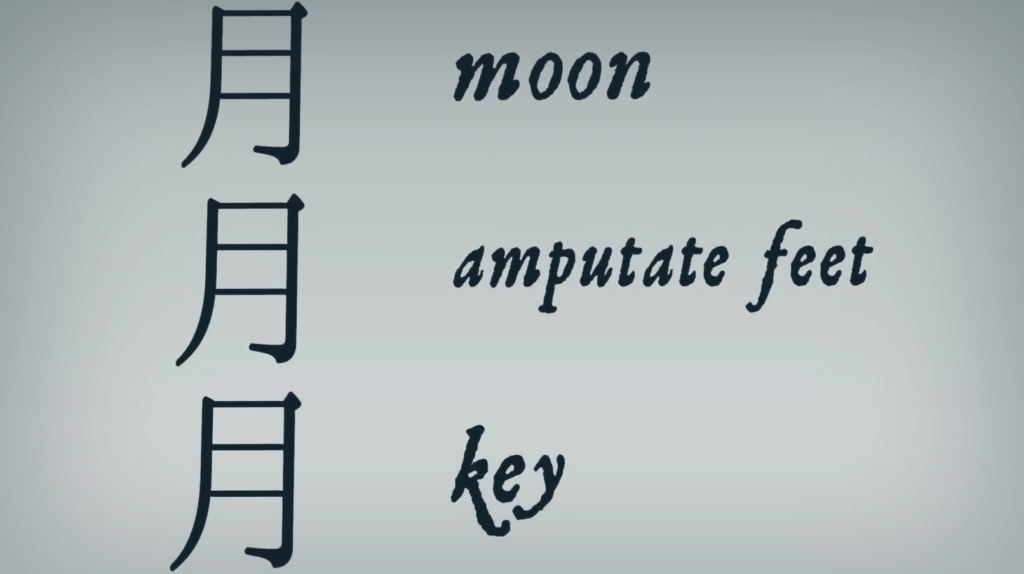
The cohesive shapes and the alternative forms of lines communicate the core of their minimalistic design aesthetic, yet it is easy to understand each feature at a glance. To resonate with this successful design to our ancient history, ancient Chinese Calligraphy shares a similar “design” process with our modern design. For instance, in Chinese, a phonetic component can provide you a clue for a word’s pronunciation, and sometimes they can all mean different things. (see example below).

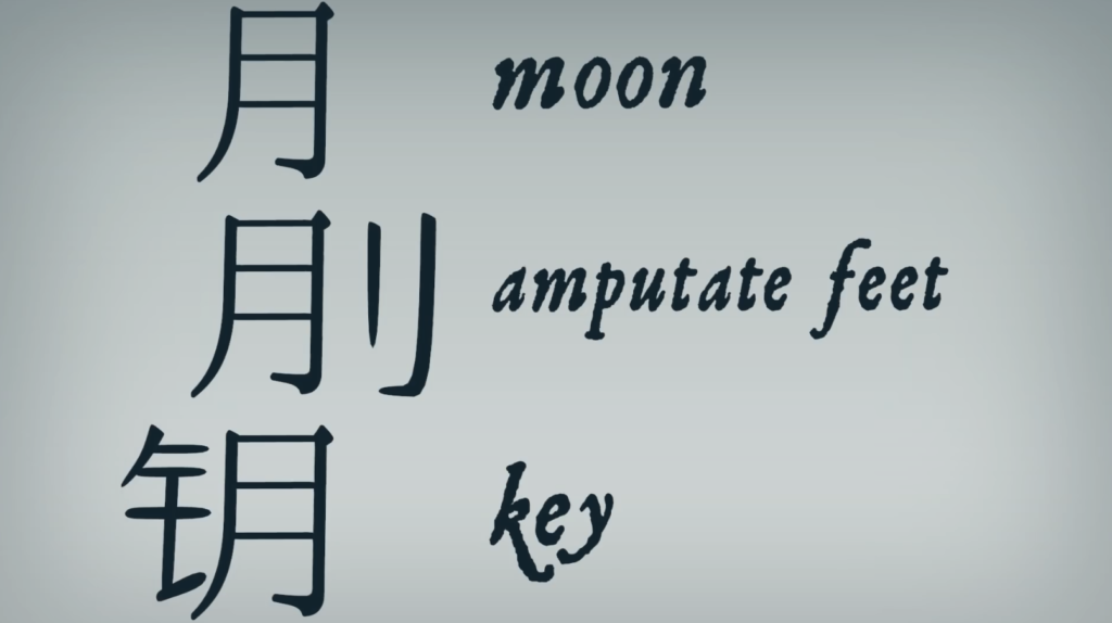
However, if you add semantic components (See example below), the extra logographs will determine what the word means and how the word sounds. This technique of manipulating each word that looks or sounds similar is called “determinative”. Just like Apple’s icon design above, they only utilize basic circles (like phonetic component) and lines (like the semantic component) to structure and configurate all the coherent icons.


I like how you introduce chinese characters and the relationship between calligraphy and the semantic components. nice work!
Hi Ted,
I personally love the iPhone photo editing interface so I’m really pleased to see a blog post about its icons! I partially disagree that the icons themselves are easily recognizable and understandable, as seeing them in a screenshot (i.e. out of context) leads me to wonder if an individual would understand them without the ability to see its effects on a photo in real-time. In reflection of my own experience with this application, I believe there to be multiple visual inputs that nudges the user to understand the function of each effect, including the real-time effects of the photo being edited and written labels (such as “Brilliance”, as shown here).
Ted – this is really interesting assessment of the chinese characters adding semantic components, like many icons need words to better understand and differentiate. The post overall would be stronger if you left out the paragraphs about elevators and just stuck to these main points about disambiguation which are super interesting and well articulated.
I totally agree with what you said that meanings of an icon these should be simplified to make it less confusing for us to understand. But, at the same time I also think that a simplified icon while necessary, isn’t fully comprehended until we reach the intended purpose for it such as a simple click on the icon itself for apps or pressing a physical button with your elevator example.