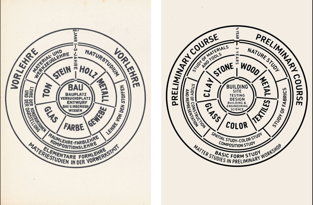
I think Bauhaus is a movement that influences interaction design. Bauhaus’s philosophy celebrates functionalism, simplicity, and accessibility in design. It advocates the use of industrial materials and inter-disciplinary methods and techniques. And you can find the exact same qualities in interaction design. Interaction design requires a more human-centered approach to design, it focuses on the practical, hands-on process of design. Bauhaus’s workshop-based education is a way to apply the principles learned in the Preliminary Course to the same practical process.
The Bauhaus finds beauty in the details, construction, and structure and it wants to strip off all other distractions. This is something that’s been a trend recently in visual interaction design with the more minimalistic and simple looks.

At the core of the circle suggests the holistic nature of a Bauhaus education is “building site, testing design, building, and engineering science” which are all the necessary steps in interaction designing.
My take on this “trend” of Bauhaus inspiration is it should be more balanced between the sterile, mass-produced, businesslike, and the personal touch in design. When pushing too far, the flatness is a risk of contradicting with the user’s learned behavior like the experience of clicking on a button is different from clicking on a square. Nevertheless, it’s still important to understand the Bauhaus’s philosophy and its great impact on interaction design.
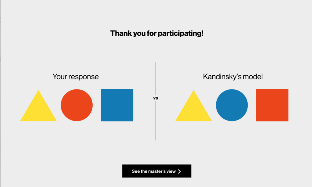
Kandinsky’s color exercise

I agree with him in the characteristics of the colors yellow and blue but not red. Hence, I choose the “powerful”,”energetic” red for circle instead. Square is more balanced,”restful” and stable than circle which is about “movement” (like a wheel) and “perfection” in my opinion. Yellow according to Kandinsky is “sharp” color and I agree, it remind me of lightning.

I am inspired by how you think microinteraction and user’s behavior changes while doing this exercise “When pushing too far, the flatness is a risk of contradicting with the user’s learned behavior like the experience of clicking on a button is different from clicking on a square.”
Interesting observation. I especially like your points on Bauhuas curriculum.
I like the color test example you provided! If you have the website address, could you attach it somewhere in the comment? I’m interested in doing that, too.
It’s from the Bauhaus reading, here is the link
http://www.getty.edu/research/exhibitions_events/exhibitions/bauhaus/new_artist/form_color/interactive/
Thanks a lot! (after 10 minutes of my comment, I realized the test was on the website that Erin provided hhh)