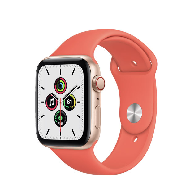
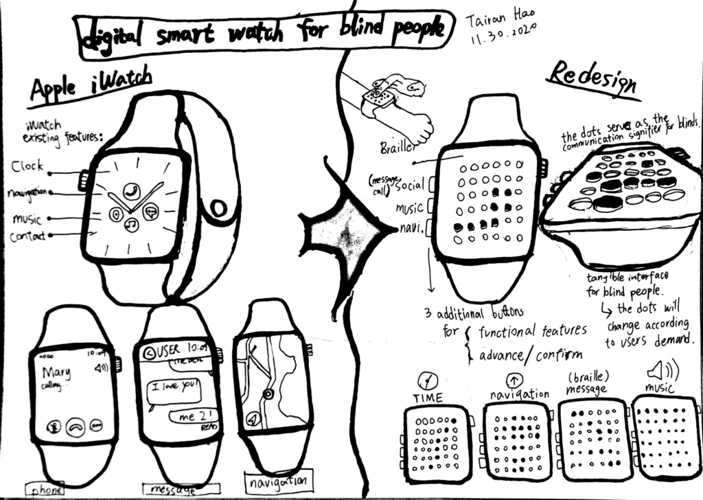
Recently, one of my friends gave me a new Apple watch as a gift. After using it, I feel that the functionality of the device can almost replace a smartphone. However, it is hard for blind people to have the same experience when using the interfaces on the watch because they cannot receive any visual feedback from the interface.

Therefore, I redesigned a tangible interface on the smartwatch for the blind group, which offers them to use the same functions just like the Apple Watch. In order to achieve ease of usability, I create new forms of signifiers for blind users. Instead of using a traditional digital interface, I apply the braille dots as a single element for the watch, which serves as the tool to transfer information to the blind.


This is an interesting concept as it utilizes the current braille alphabet we see today!
(Sorry not sure how to post pictures on the comment area but here’s a link of what I’m talking about https://www.pinterest.com/pin/5488830785546627/)
I love this concept! I was even thinking about the last iPhones with a home button and how haptic feedback vibrations simulate an actual button. Perhaps something like this could be recreated on a smaller scale to simulate the feeling of Braille?!