In my Creative Founder Project, our team is working on an online learning community for the blind. As we are conducting our MVP, I started to think, is the current design of the audio player friendly enough for the blind people to use?
If you ask blind people this question, They won’t tell you “yes”. Because they’ve been a marginalized group since the development of the web and almost has never been considered as “users” when we design any sorts of interfaces. So they never know what is a “better” experience until they have experienced one.
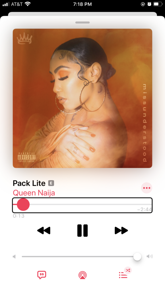
It’s our job to provide them with a better experience. Take Apple Music for example:

As people may not know, there is no dragging gesture under the voiceover mode in the IOS system. Each command is done by either a tap or a swipe. This is to reduce the error or confusion of state caused during dragging.
In order to adjust the volume and time bar shown in the screenshot, users need to swipe up/down once at a time to move the switch left/right by a certain amount. This results in a rigid interaction where the users have no customized control over the desired value. It’s basically like the most primitive buttons on the radio.
So that’s not fair. Why would blind users have to face a primitive design that’s basically no better than what came from 40 years ago?
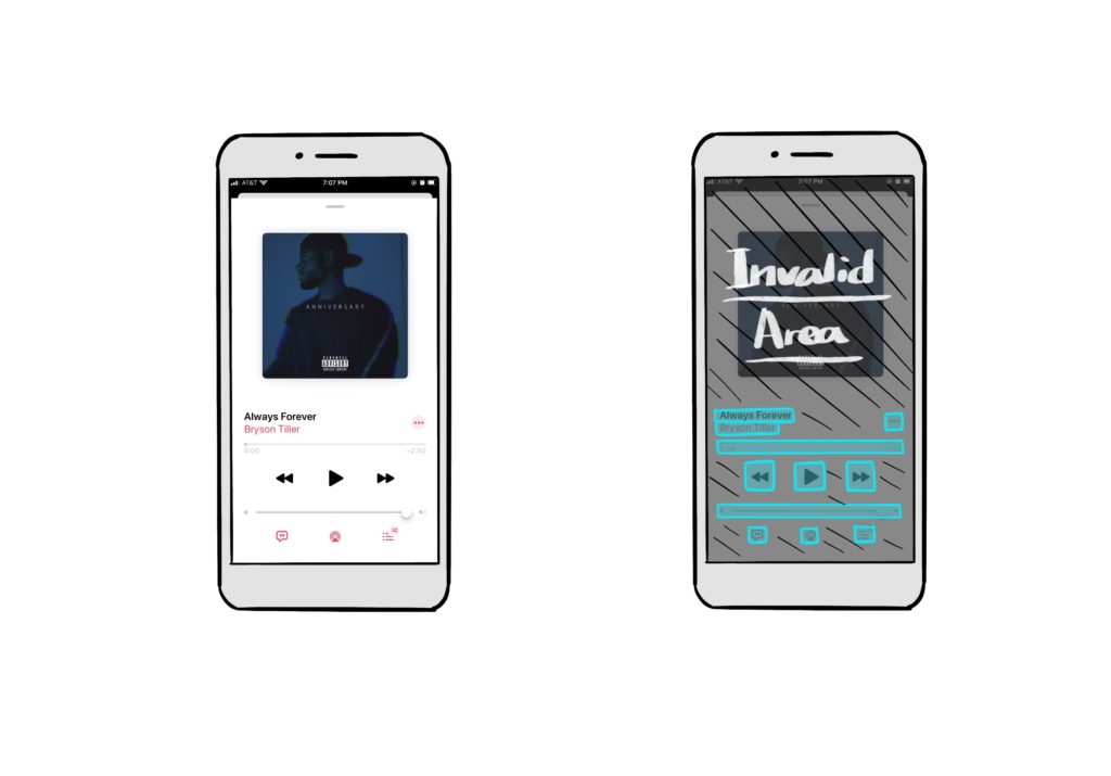
I did a UI analysis of the current music player. As you can see in the diagram, a lot of invalid areas are created for aesthetic reasons (negative spaces, visuals, photos, etc) Those invalid areas increase the chance of mis-taps for people with no vision, thus increases frictions and frustrations.

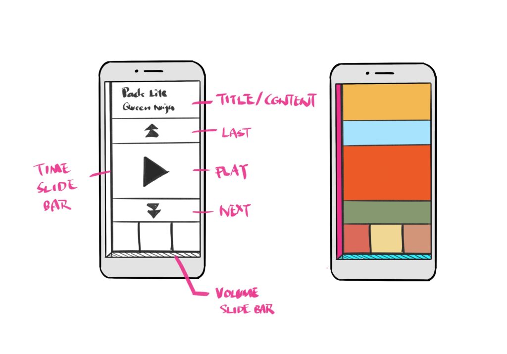
My redesign of the music player is a tile design that utilized every inch of available space on a screen, making sure there is no “empty tap“. I also added two slide bars on the left & bottom. The length of those two slide bars is almost the same as the length of the phone. So users can adjust the value by sliding along the edge of the phone. It transfers the digital measure of length into a tangible measure of length.


The no “empty tap“ really catches my eyes and I love how you explain the screen reader ahead of time.
the invalid areas actually
Nice concept and good job showing with diagrams.
very cool concept! the redesign of the slide bar indeed increase the accessibility for the blinds.
This is really practical and COOL design idea!! I noticed that problem when I was walking or running outside. I once misclicked the volume bar instead of “the next” button, and my ears just felt exploding with earphones. So I’ll definitely try your design!
OOOOh! I love this! It’s so cool and honestly it reminds me of the older windows phone OS design. They utilized boxes some smaller and some bigger but they took up the entire page like yours and there was essentially no dead space.
This is pretty fascinating to see how a music app can be tailored towards the blind!
This is a really cool concept. It reminds me of the Spotify music player screen when you are in a car. The screen changes to one with much bigger buttons and easier access to change music. This just proves how abled users can benefit from accessible design in real, everyday life situations too!
What a thoughtful project! Have you guys tested this yet? I really know what is their feedbacks on this.