One of the first things I learned about Interaction Design was about Information Architecture. We had started to understand it by using index cards marked with things you could find in a grocery store. We were tasked to group these cards in a way that made sense and then to compare it with a partner. A lot of products matched up but some people regarded things like eggs as a dairy product and others decided it fit better as a poultry product. But nobody had thought to organize the products alphabetically, and it was due to the fact that none of us had experience seeing groceries organized in that way.
I feel like now my experience with Information architecture is crossing over into my studies on behavior (with Jorge!). Thinking on how I may want to encourage specific behaviors like getting someone to sign up for a service or to get people to look up a recipe, a lot of it boils down to how the information on the page is organized and how it is presented. Is the function/ feature/ behavior upfront to the user or is it hidden behind menus? Basically, I’m asking, “how can I organize information to achieve the most desirable outcome for my users.”
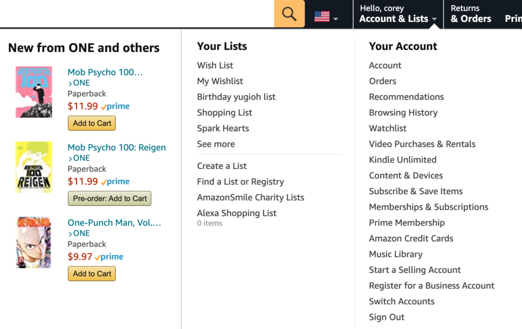
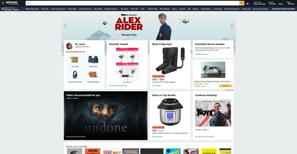
I use Amazon, (however, I am reducing the number of times I rely on them) and sometimes I want to take advantage of my subscription by utilizing their movie/ tv streaming service. Every single time I try to watch something on their site, I get lost and can’t find their movies/tv streaming page. They have a menu that allows you to access their music service, kindle, but then nothing for accessing their movie streaming! I always go to the wrong menu or have to find a round-about way (googling, “amazon streaming”) of getting to this section of their site! It’s very not obvious and I still haven’t learned.


Information architecture is different from Interaction Design because it’s just a smaller piece of the bigger whole. We use information architecture to, hopefully, make sense of organization. It isn’t noticeable to the user and covers how information is found. Interaction Design is the practice of designing interactive spaces, systems, and products where an action is made.
Information Architecture supports interaction design in that it goes over why what is happening is good or bad. They work together by supporting Usability and functionality with good design. You can have a product with lots of tools that are helpful to the user but it won’t mean anything if the tools make it harder for the user to complete their task.

Aw Corey! I was just looking at the photos from our grocery store card sorting, you had mentioned Cotton Candy Grapes and I’ve been buying them ever since!! I remember we went to Parkside after that class. Its amazing to see how much we have learned and progressed since then!
Card sorting is a quick but powerful tool in building an IA. It transfers the abstract terms into something tangible, so we as designers can find patterns by involving both our hands and our brain.
I agree that the tools should make user do the task easier than it was. I think Facebook app changes their bottom tab bar quite frequently and I don’t like it as the navigation to, for instance, a marketplace changes and I get lost.