Imagine that when people go to the supermarket for shopping, they must expect clear guide signs, so that they can quickly find the areas they want to go to and their target products. However, people in different supermarkets hope to see different guidance systems. For example, when shopping at IKEA, people certainly don’t want the same guidance from small clothing stores. In my view, these examples explain how important IA (Information Architecture) is in our life, which can also be well reflected in interaction design.
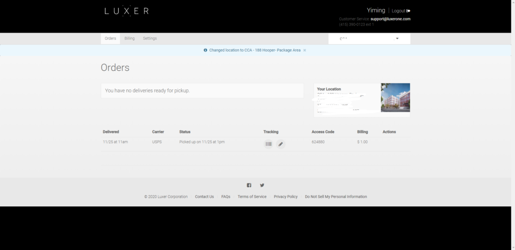
Although I haven’t done a formal IA project yet, I already know the necessity of it in interaction design. In many of my projects, especially in Visual Interaction Design class, we will study the differences between the same brand on websites, mobile apps and 3rd touchpoints. I was surprised to find that there are really big differences. Taking Luxer one as an example, the information and functions of its web page and app are almost the same, but the layout differences are quite apparent.

In the website, user information, address, menu bar and other information have very intuitive embodiment. Since the web page has a sufficient display area, people don’t want to have any hidden features.
On the main screen of the app, however, there is only one main function, which is also the main function of this brand. Due to the limited screen size of the phone, many secondary information and navigation will be collected in a”hamburger icon”.
In the kiosk version, it only has the function of picking up packages (including signature and grading part), which ensures convenience and timeliness.
Therefore, interaction designers should consider how information and functions should be reflected in different touchpoints with clear IA.

“Interaction designers should consider how information and functions should be reflected in different touchpoints with clear IA.” I agree with you. Thank you for your sharing that!
You pointed out the feature I never thought about IA. Is cool that you point out how different IA for different devices can come out with very different UI design and structure. Each device has to do its work to do.
Thank you for sharing! that’s very interesting, good to know about IA in different touchpoint!