Words like “data” and “system” frighten me: whenever I see these two words, I feel like they have to do with complex materials and information or stuff that requires much effort to figure out. When I encounter any academic material with these two words, my enthusiasm would be deflated by half. Just like when I was ready to watch The Five Types of Organizing Information by Richard Saul Wurman, I anticipated something bewildering. However, I was surprised the five types of organizing information that Wurman talked about within just one minute were extremely easy to understand – from alphabetically to sizing, all these five ways are fundamental to our human nature. We perform some of these methods on a daily basis.
These primitive ways of Organizing Information reminded me of the first exercise we did in System class in my sophomore year – candy sorting. We sorted candy from different colors, then different flavors, and even opaque packaging versus transparent ones. There were so many creative ways we could come up to sort out these candies. If you were a stranger who happens to walk by our class, you probably would think you just witnessed a bunch of preschool students doing their candy activity. To me, I never would expect the first thing we did in one of the difficult classes was to sort out candies. Nevertheless, the candy sorting activity was crucial for us, as interaction designers, to understand the technological and logical part of working with data and how each organization is conducted with the consciousness of IA.

Information architect works with data. They often maneuver and translate data into a structural design to provide an accessible way to manage the digital landscape. Today, in the interaction design field, it is critical for us to understand how IA works. The goal of our practice is to deliver a user-friendly experience for the users. Therefore, IA helps us to organize the infrastructure of all of the content so that our product could afford to have a smoother and effortless experience for everyone.
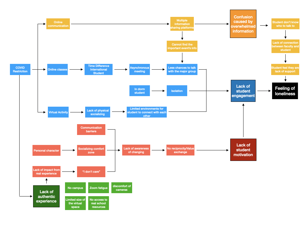
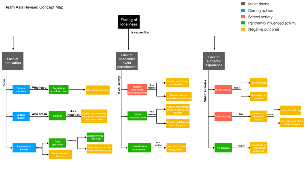
Understanding how to make a good IA can be technical, and it requires a lot of visual articulation and precision. In my recent project, my team and I made a concept map to comprehend how loneliness impacts students’ life. At first, our concept map was resourceful but hard to read and confusing. It lacked hierarchy and other visual clarity. After the final revision, our map was more structured and consistent since we added a distinctive hierarchy and re-categorized all of the components.


I’m glad you referenced the candy sort as an aid to understanding IA. I find it one of the most approachable ways to get your head around metadata and categorization. Plus you end up with candy!
i appreciate that you are using an example from our service design project. I agree with you that the second map is clearer than the first one because of its hierarchy and content arrangement
Hi Ted! This was a really fun read. I really enjoyed your sense of humor, and seeing how your work evolved with practice and experience!