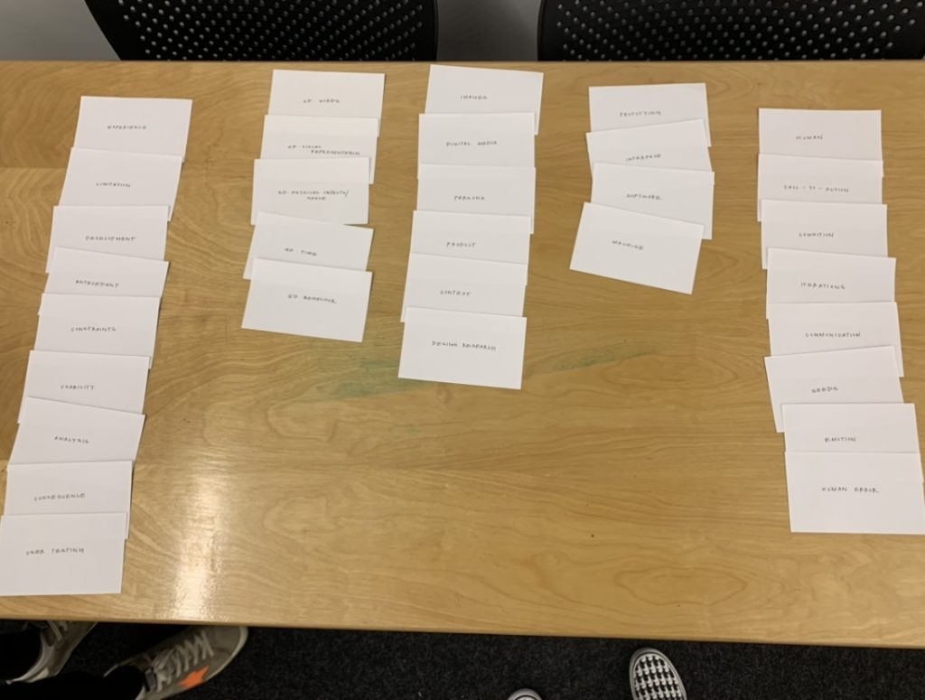
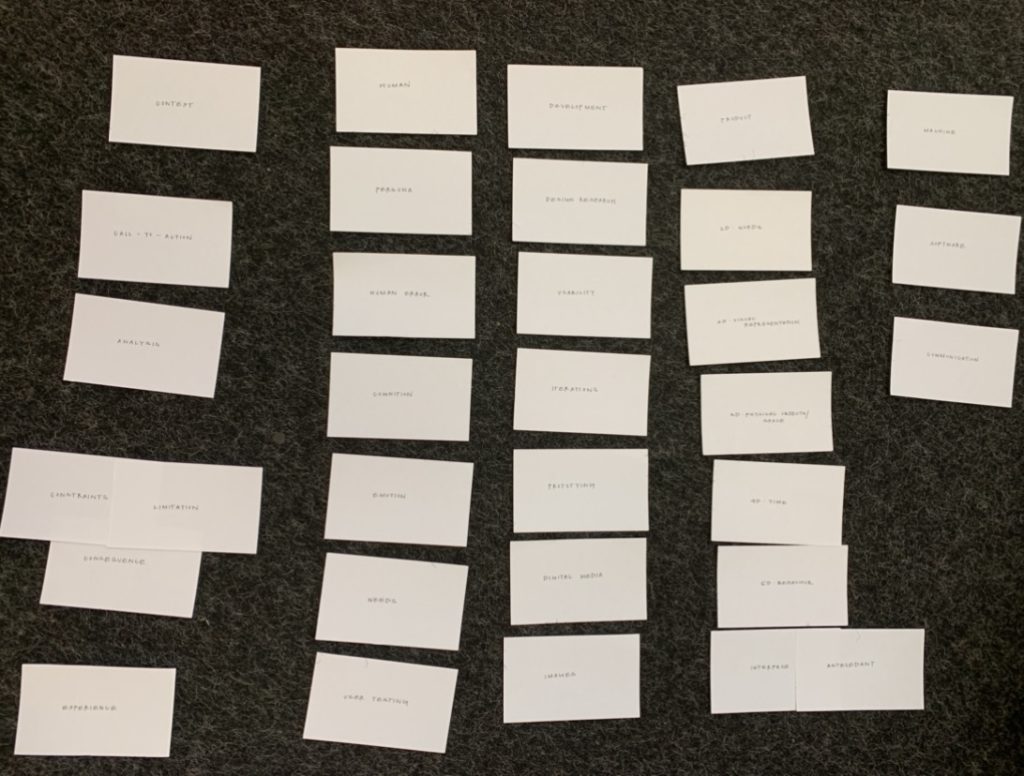
As an Interaction Design student, I’ve learned to appreciate the exhilerating practice of rapid iteration. There is something so fun about producing work as quickly as possible and receiving feedback at rapidfire pace, repeating the process to determine the trajectory of a project. Within my work, I have participated in the process of Information Architecture through card sorting and whiteboarding.

Although it isn’t the most ecologicially conscious practice, card sorting provides us with a tangible methodology of organizing information. As we’ve moved to digital tools such as Mural in place of post-its, I have observed that the physical picking-up of a piece of paper and grouping it with another is lost when clicking and dragging through a screen. Additionally, there is a satisfaction in finally sorting out a heavy stack of index cards into comprehensible stacks.
The process of IA reminds me of rapid prototyping in Interaction Design, particularly in paper prototyping before moving to digital iterations. The process is quick and dirty. It provides us with a moderate amount of data through testing within a short amount of time, without sacrificing the human-factor. We can directly observe the manner in which participants think through their choices in grouping particular items together, similar to having user research participants speak through their decisions as they navigate a paper prototype. By doing so, we begin to notice patterns that inform our work to be usable to as much of the relevant target audience as possible. The ephemerality of paper prototyping and card sorting coincides with the fast-pace of technological developments in general; although an end-user may only be interacting with an intuitive interface, the process to determine what users consider “intuitive” requires designers and information architects to move very quickly.
I believe IA is different from Interaction Design because it seeks to so closely follow the current mental model of the end-user. Although we do the same in Interaction Design to encourage a higher likelihood of product adoption, it is even moreso important in IA that users’ expectations are met when looking for an item. Our primary goal as Interaction Designers is to provide users with a usable experience, and a delightful experience is even better. Interaction Design may support the usability of a product’s information architecture by providing users with opportunities to back-track when something doesn’t go as planned while maintaing low cognitive load. One of my favorite elements are breadcrumbs, which allow users to see where they’ve been, and assess what path they could try instead to fulfill their tasks and goals. Ultimately, both practices are at their best when they empathize with the end-user; and through rapid iteration and testing, we may continue to create human-centered experiences.


There is another kind of understanding that happens when we work with physical artifacts. Using real cards, or paper, or real post its and physically organizing them creates a kinetic understanding that is deeper than just the cognitive layer that you. might get using a digital tool. It’s similar to sketchnoting – using verbal and visual to deepen understanding.
I agree that the transition to using mural and participating in IA digitally has taken away from some of its value. I think we need to find ways to optimize these processes or perhaps return to the classic card sorting.
I like your analysis of the process of Information Architecture! Very detailed. I learned what is breadcrumb after reading your post!