In the last couple of days, my macOS got updated from “Catalina” (I was super excited about the dark mode when it first came out ) to “Big Sur,” a brand new desktop operating system for macOS. When my laptop finished the update, the new look sort of nudged me to clean up and reorganize my desktop because the new design looked so elegant, and it felt weird not to make my desktop look immaculate. The latest update was pure excitement for me because I was amused and directly influenced by the refinement they have made. Whether they are visuals or new interactions, Apple brought their minimalistic aesthetic and intuitive design to the next level, becoming the trend or the standard for the design field. I have noticed the trajectories of interaction design and visual design align with what Apple has offered to their product: the clearer and flatter look of UI; the semi-transparent windows and boxes; the monotonous color scheme for the logos and icons – everything has become lesser and more precise.
Aside from its beautiful visuals, Apple also provides a cohesive and intuitive user experience for the customers. By putting in half of the effort, users can get twice the outcome for what they want to achieve. With the modifications like instant page preview on the tap redesign and viewing any app information within one simple touch, Apple has finessed every aspect of user experience, demonstrating their resolution and achievement in explicit and implicit design. I believe the future of interaction design will be continually inspired by Apple’s design principle: the user interfaces are going to be composed of thin lines, flat shapes, and few selective colors; the user experience is going to be seamless and intuitive, every microinteractions and small gestures will be considered as opportunities to elevate the experience.
We can’t talk about the future of design without bringing up the topic of design ethics, which is another crucial aspect of being in the design field. Ever since the beginning of the information age, an increasing number of designers and companies have been acknowledging and putting a lot of emphasis on design ethics and how it would ultimately change the dynamic of the digital world. For the past couple of years, I learned that design ethics are about being a mindful designer by considering sustainability, accessibility, and inclusivity every time we design. Big companies like Google and Airbnb have embodied these essential qualities into their work and environment. However, after reading the Future Wheel by Majid Behboudi, I realized there is something more significant to consider – a place to fathom and envisage the possible future – the future of the product, and its positive and negative impacts. Future Wheel is the tool to help us to acquaint ourselves with multiple parallel futures while designing. It establishes the ethical framework for designers to measure the future outcome in the most humane and rational way.
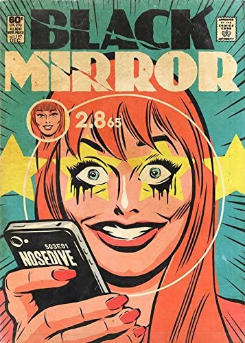
On the Future Wheel, it has three distinct layers of consequences. From the first level to the third level, each level increases the seriousness of the event and outcomes. It is like a butterfly effect where the first level of consequences may seem insignificant, but it can directly or indirectly affect other things and eventually brings a bigger impact to other levels of consequences. Many dystopian science fiction movies have demonstrated the peril of the unpredictable relationships between humans and advanced technologies. For instance, in one of the Black Mirror episodes, Nosedive showcased the pitfall of a society obsessed with social status from rating each other. The first level of consequences would be people only pay attention to their rating status and neglecting other parts of their social life; The second level of consequences would be people having ingenuine connections by putting on an act every time they interact with each other, and the third level of consequences would be people’s mental health are insidiously influenced and eventually driving themselves crazy. What was displayed in Nosedive was scary yet accurate, and our reality is not far from it. As future designers, we have to be critical thinkers and to have the mental model of what the future wheel offers in the back of our heads. Therefore, we can prevent the reenactment of these tragedies of technology and bring the harmony of human and technological advancement into a prosperous future.


I love this and I totally feel the same way. It seems like everytime someone knocks Apple for doing something, those same people end up accepting it a year or so later and it becomes the norm. I also feel like I was ready for the line of iPhone 12’s (returning to iPhone 5-like design) like 3 years ago. At this point I really can’t wait for the notch to go and I wouldn’t care if the charging port were to go…
Very interesting ! thank you for sharing !
Do you believe that interaction design will always follow Apple? Or is there room for interaction designers to be creative, innovative and explorative and therefore influence the direction of Apple. I personally think that Google’s flat Material Design influenced the flatter cleaner direction of Apple’s experiences. Prior to that, they were using skeumorphic metaphors and everything was mimicking real world textures and shapes.