Posts by Judith Weng

How Grocery Delivery Drones Could Change the Future

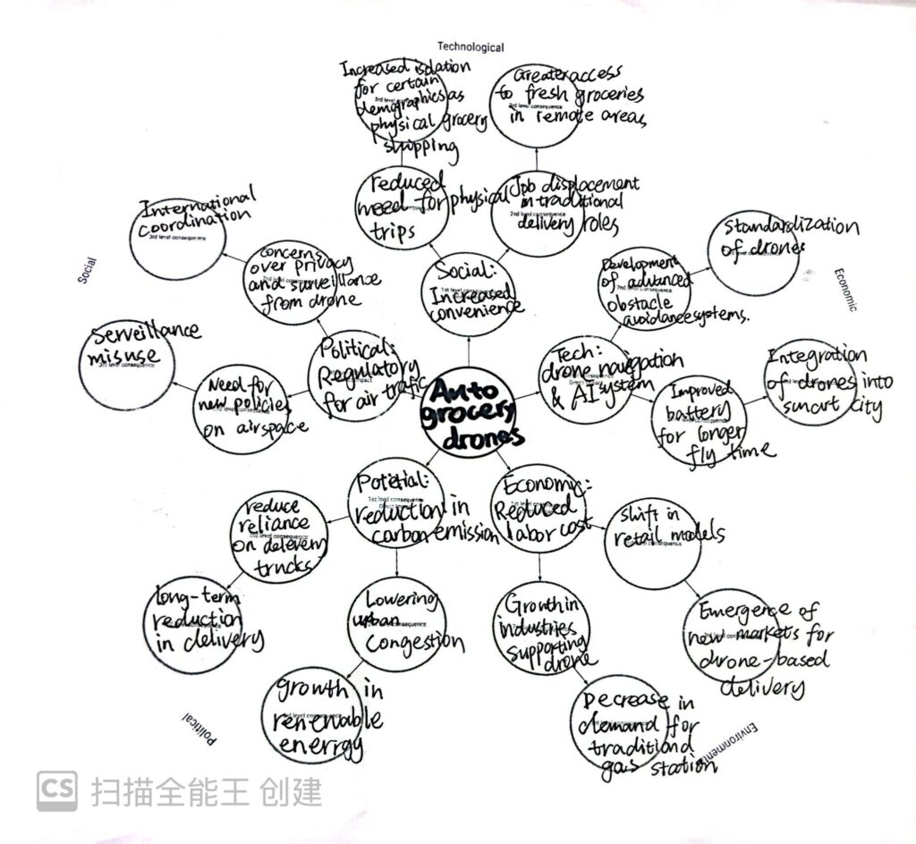
Autonomous grocery delivery drones are a future idea to make life easier. They use drones to deliver groceries instead of trucks or bikes. This can save time, reduce traffic, and lower pollution. It also helps people in remote areas get fresh food. However, there might be problems, like fewer jobs for delivery workers and concerns about privacy. I think it’s interesting to see how this idea could change our daily lives and the world around us.

Ada Lovelace and Lillian Gilbreth: Pioneers in Interaction Design History

As an interaction design student, I’ve realized how much our field owes to the work of early innovators like Ada Lovelace and Lillian Gilbreth. Even though they lived in completely different times and worked in different fields, both women laid the foundation for how we think about systems, efficiency, and human-computer interaction today.

Ada Lovelace is often called the first computer programmer. In the 1840s, she worked with Charles Babbage on his Analytical Engine, a mechanical computer. What makes her so important is that she didn’t just see the machine as something that could calculate numbers—she imagined it could create art, like music, by following instructions. This early vision of computation as more than math feels like the root of modern interaction design. Her work reminds us to think beyond the technical and consider the creative possibilities of technology.

Lillian Gilbreth, on the other hand, was a pioneer in industrial engineering and ergonomics. In the early 20th century, she studied how people interact with tools and systems, using motion studies to improve efficiency and reduce fatigue. Her focus on designing workflows to fit human needs connects directly to what we do as interaction designers. When we create user-centered interfaces or improve accessibility, we’re following her example of putting people first.

These women remind us that interaction design is not just about technology—it’s about understanding people and imagining new ways to improve their lives. Knowing their stories gives me a deeper appreciation for the history of our field and the responsibility we have to carry their legacy forward.

The Ethical Responsibilities of Interaction Designers in the Age of AI

As an interaction design student, I often think about the role we play in shaping the digital world. Our work isn’t just about making interfaces easy to use or aesthetically pleasing; it’s about creating experiences that respect and empower people. When AI comes into the picture, this responsibility grows even bigger.

AI can be incredibly powerful. It helps automate tasks, makes predictions, and personalizes experiences. But it also raises questions. Are we protecting user data? Are we avoiding bias in AI algorithms? Are we designing systems that explain themselves clearly? These are just a few of the ethical challenges we face.

For example, think about a chatbot powered by AI. If it doesn’t tell the user it’s a bot, is that misleading? Or imagine an AI-powered recommendation system that only suggests products based on profit margins. Does that respect the user’s best interests? These small decisions can have big consequences.

As designers, our ethical responsibilities include:

  1. Transparency: Users should understand how AI is making decisions. For instance, if an algorithm recommends a product, users deserve to know why.
  2. Privacy: Collecting data is necessary for AI, but we must minimize it and make sure it’s stored securely. People trust us with their personal information, and we shouldn’t take that lightly.
  3. Fairness: AI can reflect biases in the data it’s trained on. It’s our job to spot these biases and advocate for systems that treat all users equally.
  4. Empathy: Our work should help, not harm. This means designing for accessibility, considering edge cases, and avoiding manipulative practices.

AI is a tool. Like any tool, it’s neutral until we decide how to use it. Our decisions as interaction designers give AI meaning. So, while the future of technology is exciting, it’s also a reminder: the ethical choices we make today will shape the experiences of millions tomorrow.

How Will AI Change Our Lives in the Next 10 Years?

After walking through the Computer History Museum and seeing all the old tech, from early computers to the evolution of AI, I couldn’t help but think about where we are now—and where we’re heading. At the end of the chatbot and AI exhibit, there was this question: How will AI change the way we work and live in the next decade? It stuck with me.

Looking at how fast technology has grown, it’s clear AI is going to have a huge impact. But what does that actually mean for us?

AI is already changing work, and it’s only going to go further. Right now, it handles boring, repetitive tasks, like data entry or scheduling. In the future, I think it’ll become more of a partner—helping us brainstorm ideas, solve problems, and even make decisions.

  • Imagine designers using AI to quickly create prototypes or writers using it to polish drafts.
  • Jobs won’t necessarily disappear, but they’ll change. Instead of doing the same tasks over and over, we’ll focus more on creative and strategic work.

In our daily lives, AI will probably feel even more personal.

  • Smart homes will actually know you. Your house might adjust the lights, temperature, and music based on your mood.
  • Health tech will go next level—AI could track your health in real time and even predict issues before they happen.
  • Entertainment will feel custom-made. Imagine Netflix not just recommending shows but creating content based on what you love.

The Big Picture

Looking back at the tech in the museum, it’s clear that change happens fast. Just a few decades ago, we didn’t even have personal computers, and now we’re talking about AI running entire workflows or helping doctors save lives.

In the next 10 years, AI won’t just be a tool we use—it’ll feel like a part of our lives. The key is finding a balance: using AI to make life easier without losing control of what matters most.

So, how do you think AI will shape your world? It’s exciting, a little scary, but definitely something worth thinking about.

How Pace Layers Shape Interaction Design

Ever wonder why some parts of design work feel like they change every day, while others barely budge? That’s where Pace Layers come in. Originally from Stewart Brand, this framework breaks systems into layers that evolve at different speeds. Here’s how they affect the lifecycle of interaction design:

Fashion/Technology
This is the surface-level stuff—UI trends, new tools, and frameworks. They’re exciting but short-lived. Think of flat design vs. neumorphism. Stay aware of trends, but don’t overcommit.

Commerce
Business goals and market demands evolve slower but still shift regularly. For example, prioritizing personalization in apps because it boosts sales. Designers must adapt while maintaining consistency.

Infrastructure
This includes design systems, usability standards, and codebases. These layers are more stable, forming the backbone of design work that supports rapid changes above them.

Governance
Policies and platform guidelines move at a crawl but have lasting effects. GDPR, for instance, changed how we think about user privacy—long-term impact, not a quick fix.

Culture/Nature
The deepest layers. Human cognition and cultural norms evolve over decades. Timeless design principles, like simplicity and clarity, live here and remain central regardless of trends.

    Why It Matters

    Good interaction design balances these layers. Trends keep work fresh, but stability and cultural alignment make it meaningful and lasting. Recognizing these layers helps us prioritize what matters most for designs that stand the test of time.

    The Interaction Revolution: How Web 2.0 Changed the Internet

    Back in the Web 1.0 era, the internet was pretty much a read-only experience. Websites were static, almost like digital brochures. You could consume information, but that was it—no commenting, no sharing, and definitely no collaborative features. It worked, but it wasn’t exactly engaging or interactive.

    Then Web 2.0 came along in the early 2000s and flipped the script. Suddenly, the internet wasn’t just about reading content—it was about participating. The key difference? Interaction became central. Platforms like Facebook, YouTube, and Twitter gave us the tools to share our own thoughts, upload videos, and engage with others. Blogs allowed anyone to publish their ideas, and comment sections turned one-way communication into conversations.

    A few specific shifts made Web 2.0 stand out:

    Dynamic Content: Instead of static pages, websites started updating in real time. Think of how social media feeds constantly refresh with new posts.

    User-Generated Content: This was huge. For the first time, people weren’t just consuming information—they were creating it. Platforms like YouTube made it easy for anyone to upload videos, and suddenly everyone had a voice.

    Social Networking: Web 2.0 wasn’t just interactive—it was social. Facebook and MySpace let people connect with friends and build online communities, creating entirely new ways of interacting.

    Personalization: Websites started adapting to users. Algorithms on platforms like Amazon or Netflix recommend products and shows based on your behavior. This made the experience feel personal, not generic.

      Fast forward to today, and the web has evolved even more. Web 2.0 laid the groundwork for what we now take for granted—real-time interaction, user-driven content, and personalized experiences. But now, technologies like AI and blockchain are shaping the next phase. We’re seeing smarter, decentralized systems that go way beyond what Web 2.0 could offer.

      Looking back, it’s clear Web 2.0 was a turning point—it didn’t just change how we interact with the web, it redefined our role in creating and shaping the digital world. For anyone studying interaction design, this was the moment the internet truly became a collaborative space.

      How the iPod and iPhone Changed the Way We Connect with Technology

      The iPod and iPhone didn’t just change how we use tech – they totally shifted our relationship with it. Before these devices, tech felt kind of distant, like something you used when you had to. Computers were stuck on desks, and gadgets were more about functionality than personality. But then Apple came along and said, “Hey, what if tech wasn’t just useful but also fun, personal, and even emotional?” And that changed everything.

      Take the iPod, for example. It wasn’t the first MP3 player, but it was the first one that made listening to music feel cool. Suddenly, your music wasn’t just a collection of songs – it was your soundtrack, something you carried with you everywhere. The scroll wheel, the simple interface, the sleek design – it all made using the iPod feel intuitive and satisfying. You weren’t just using a device; you were having an experience.

      Then came the iPhone, and it took things to a whole new level. It wasn’t just a phone or a way to check email; it became the ultimate all-in-one device. The touchscreen felt like magic (no buttons?!), and apps turned it into whatever you needed it to be – a camera, a GPS, a gaming console, or even just a flashlight. The iPhone made tech feel human. It was designed for how you live, not the other way around.

      So, how does this affect interaction design? It’s all about understanding that tech isn’t just tools anymore; it’s part of our daily lives. Good design has to feel natural, almost invisible. It’s about creating products that don’t just work but fit seamlessly into our routines and even evoke emotions. Apple nailed this by focusing on simplicity, aesthetics, and user experience. They showed that design isn’t just how something looks – it’s how it makes you feel.

      In a way, the iPod and iPhone set the standard. Now, whether it’s an app or a gadget, the goal is to make technology feel personal and effortless. And honestly, who wouldn’t want that?

      From Web Design to User Experience Design & Do Design Systems Kill Creativity?

      Recently in class, we discussed the transition from Web Design to User Experience (UX) Design, and I found it pretty interesting.

      The Shift from Web Design to UX Design

      Web design used to be more like “decorating”—making a website look nice and polished. Designers focused on neat layouts, good color schemes, and making sure buttons didn’t look ugly.

      But now, UX design is all about how users feel and interact with the product. It’s like decorating a house: not only does it need to look good, but it also needs to be functional. For example, the light switch should be within reach, and the layout of the rooms should make sense. UX designers care about every detail of how users experience a product: Is this button easy to click? Is the process straightforward? Does this page make the user feel good?

      This shift happened because the internet has become a bigger part of our lives, and digital products are more complex. It’s not enough to just look good anymore; designers need to understand user psychology, analyze data, and collaborate with teams to make things work… Being a designer isn’t easy these days 😂.

      Do Design Systems Kill Creativity?

      Now, here’s the hot topic we debated: Do design systems and interaction patterns kill creativity?
      Design systems are like rules for designers, such as Google’s Material Design or Apple’s Human Interface Guidelines. Interaction patterns are similar templates, like having navigation bars at the top of a page—it’s practically a standard now.

      Some people think following these rules is boring, like being a factory worker, and everything ends up looking the same.

      But I think these systems actually give us more time and energy to focus on real innovation. It’s like cooking: if the basic ingredients and seasonings are already prepped, you can experiment with new flavors without worrying about the fundamentals. Design systems improve efficiency and help users quickly get used to a product (because they’ve already learned similar patterns). Imagine if every app had its “back” button in a different place—users would go nuts!

      Design systems and interaction patterns are tools, not shackles. It all depends on how designers use them. Sure, there are some basic frameworks, but whether you can add a unique touch to them is up to your skills. Design is about making users happier and their lives easier, not just about being “different.”

      So yeah, while the design field is getting more and more “competitive,” it’s also becoming more exciting. What do you think? Let’s chat in the comments!


      Who Should Drive Innovation: Government, Corporations, or Open Source?

      As an interaction design student, I often wonder about where technology comes from and where it’s headed. Many of the technologies we rely on daily—like the internet and GPS—were initially funded by government and defense budgets. So, who should be responsible for inventing new technology in the future? Should it be governments, corporations, or open-source communities?

      Long-Term Investment and Public Interest

      Government funding often leads to foundational technologies that prioritize public interest over profit. Since governments don’t face the same profit pressures as corporations, they can afford to invest in high-risk, long-term research that might not show immediate results. This approach can be beneficial for society as a whole, creating infrastructure that everyone can use.

      Speed and Scalability

      On the other hand, corporations have the resources and competitive drive to scale technologies quickly and bring them to market. Companies like Google, Apple, and Tesla are continually pushing boundaries in AI, hardware, and clean energy. But their focus is often profit-driven, which can limit access to technology or prioritize revenue over user needs.

      Community and Transparency

      Finally, open-source projects encourage a community-driven approach where transparency and collaboration are key. Innovations from open-source communities, like Linux and Mozilla Firefox, allow anyone to contribute and benefit from the technology. Open-source projects tend to focus on accessibility and user-centered design, aligning well with the values we learn in interaction design.

      A Balanced Approach

      In reality, a mix of all three is ideal. Governments can provide the initial funding and long-term vision, corporations can drive large-scale adoption, and open-source communities can ensure transparency and access. Together, they can create a tech ecosystem that benefits everyone—an inspiring idea for any design student!

      The Evolution of the Graphical User Interface: From Early Macintosh and Windows to Today’s Improvements

      With the rapid advancements in technology, graphical user interfaces (GUIs) have undergone an incredible transformation over the past few decades. As a student of interaction design, I find that exploring the evolution of GUIs not only sheds light on design’s journey but also opens up opportunities to think about how we can improve interfaces to meet the needs of today’s users.

      The Beginning of It All

      Looking back to the 1980s, when Apple’s Macintosh and Windows 1.0 made their debut, GUIs represented a true revolution. Before this, computers were primarily operated through command lines, requiring users to type specific instructions to perform tasks. The GUI changed everything, giving users a “what you see is what you get” experience with direct, visual interaction. Apple’s Macintosh, for example, introduced icons, windows, scroll bars, and, of course, the mouse—fundamentally transforming how people interacted with computers. The early GUIs may seem basic by today’s standards, but they set essential design principles that continue to guide modern GUIs—clarity, consistency, and ease of use.

      These early GUIs were composed mainly of square windows, grayscale palettes, and minimalist icons, with features focused on office work and file management. Though simple, they laid the foundation for the user-friendly interfaces we’ve come to expect.

      The Evolution of GUI

      As technology improved, so did the design of GUIs, evolving to include both aesthetics and functionality. The rise of mobile devices—especially after the iPhone—ushered in the era of flat design. With mobile apps requiring simple, intuitive interfaces, flat design not only reduced visual clutter but also made touch interactions more straightforward.

      At the same time, increased computing power and higher user demands allowed for more dynamic, complex GUIs. Animated interactions, micro-transitions, and dark modes have made modern GUIs more engaging, but with these enhancements come challenges. Designers must balance aesthetics with functionality. Overloading GUIs with visuals can reduce information clarity, while oversimplifying design risks leaving users lost in hidden actions or gestures.

      Core Design Principles That Remain

      Despite all the visual and functional changes, the core principles have stayed remarkably consistent. Users still want interfaces that are intuitive, responsive, and consistent. Mental models—the way users expect systems to behave—remain crucial in design. Designers must ensure that interface elements align with these expectations to avoid confusing users. The folder icon, for instance, still represents file storage, and clicking an icon still means accessing a program or viewing content. These enduring design elements make it easier for users to transition between older and newer interfaces, reducing learning time.

      Wrapping It Up

      As an interaction design student, I believe the future of GUIs lies in personalization, accessibility, and multi-modal interactions. It’s up to us to not only create beautiful interfaces but also to build smarter, more intuitive, and inclusive experiences that genuinely help users. The future of GUIs is about flexibility and choice—letting users interact freely while embodying the “user-centered” philosophy that defines great design.
      “From Copiers to User Experience: How Lucy Suchman Changed the Way We Design Technology”

      Lucy Suchman’s work has had a huge impact on how we think about the relationship between people and technology. I watched a video of her research at Xerox on how people use photocopiers, and it made me realize that we often think that if something works technologically, it should also work for people. But that’s not always the case.

      In her famous study, Suchman observed how copier operators dealt with the machines, despite the fact that the designers thought they had created user-friendly technology. The glaring problem was that people often used copiers in unexpected ways or misunderstood the instructions, leading to frustration. This isn’t because the user is doing something “wrong” – it’s because the design doesn’t take into account the real-world behaviors and needs of the people using the machine.

      Suchman introduced the concept of “situated action,” whereby how people use technology depends on the context in which they find themselves. It’s not enough to design something that works in theory; it must also work in real life and take into account all the unpredictability that comes with it. Her work has made designers and researchers aware that human behavior is flexible and often improvisational. It changes the idea that we only need to “train” users to use technology correctly.

      In her reading, Suchman’s argument was that in order to design better technology, we need to observe and engage users throughout the design process. This idea is now at the heart of user-centered design, which focuses on understanding the needs of users, not just on making technically complex things.

      “Xerox Star: The Forgotten Pioneer That Shaped Modern Computing”

      The Xerox Star, released in 1981, didn’t sell well, but it changed the future of personal computing in big ways.

      The Star was the first system to use a graphical interface with icons, windows, and a mouse. Before this, people used text commands to control computers, which wasn’t easy for non-experts. The GUI made computers much more approachable for everyday users.

      It also introduced the idea of a desktop with files and folders represented as icons, similar to a real desk. This made organizing digital files more intuitive.
      Even though it wasn’t a commercial success, the Star heavily influenced later systems like Apple’s Macintosh and Microsoft Windows. A lot of what we consider standard today—like drag-and-drop and networked offices—originated from the Xerox Star.

      In short, the Xerox Star set the foundation for the personal computers we use now, making them more user-friendly and practical.

      Field Trip: Exploring Creativity at an Exhibition of Works from the University of Art and Design Geneva

      Visiting an exhibition of student work at the University of Art and Design Geneva was an inspiring experience. From experimental typography to interactive installations, the work on display reflected a wide variety of creativity. What stood out to me was the conceptual depth behind each project – the design outcomes were formed with a clear emphasis on research and critical thinking.

      One installation in particular caught my eye, which utilized motion sensors to create an interactive light display. It’s not just about the technology – the project explores the relationship between human existence and environmental impact, making viewers think about how our actions affect the world around us.

      There were also a number of works of very interesting degrees that drew one to think about the relationship between humans and AI today, and the benefits that AI can bring. I think the work about the flame is also very interesting, at first I thought it was just an ordinary photography, but after I understood it, I realized that it has a deeper meaning, which provokes me to think about AI.

      All in all, this exhibition gave me a sense of the power of design to challenge convention and push boundaries. As a student of interaction design, seeing how other people solve design problems in innovative ways encourages me to keep experimenting and questioning traditional methods. It reminded me that design is not only about aesthetics, but also about creating meaningful experiences that resonate with people on a deeper level.

      “Designing with Empathy: Lessons from the AR Tour”

      Attending the BayCHI presentation on “Co-Designing the Thamien Ohlone Augmented Reality Tour” was a one-of-a-kind experience that helped me understand interaction design better. The emphasis on co-design with indigenous populations stood out to me. It was more than just producing an AR tour; it was also about collaborating with the Thamien Ohlone people to tell their own experiences.

      This collaborative approach prompted me to reconsider how I could more completely engage people in the design process. I was also fascinated by the application of augmented reality. Instead than simply overlaying facts, it enabled narrative that brought the Ohlone people’s history to life, linking the past and the present. This got me thinking about how AR could be used in other educational or historical contexts, producing.

      This presentation prompted me to reflect on my own work. I want to experiment with more ways to include augmented reality into my ideas, and I am motivated to think more carefully about the cultural and ethical implications of my designs. Most importantly, I will consider how to incorporate people into the design process in order to develop experiences that actually resonate with them.

      The Birth of Modern Computing: A Look Back at Douglas Engelbart’s Revolutionary 1968 Demo

      In 1968, Douglas Engelbart and his team at the Stanford Research Institute (SRI) delivered the “Mother of All Demos,” which has since become legendary. This 90-minute demonstration showcased technology that fundamentally altered computing. Engelbart’s demonstration was more than merely significant; it signaled the beginning of interactive computing as we know it today.

      What Made the Demo Revolutionary?

      Engelbart’s vision stood in stark contrast to the days when computers were largely utilized for number crunching and batch processing. His demonstration included pioneering innovations such as the computer mouse, hypertext, Windows-based interfaces, and collaborative editing. These concepts would form the backbone of personal computing, influencing how we interact with computers on a daily basis.

        The Legacy of the Demo

        Many of Engelbart’s innovations were not extensively adopted until decades later, but his ideas had a significant impact on the development of personal computing. Engelbart’s demo inspired the development of graphical user interfaces (GUIs) by Apple and Microsoft, as well as the hyperlink structure of the internet and real-time digital collaboration.
        Engelbart and his colleagues not only predicted but also molded the future of computing by daring to conceive computers as tools to boost human intellect and collaboration.
        The “Mother of All Demos” is a testimony to mid-century invention, and its legacy can still be felt in every device and application we use today.

        Evolution of the icon and its history

        When comparing modern mobile app iconography to ancient writing systems such as Egyptian hieroglyphics or Mayan pictographs, it is evident that both types use images to transmit concepts swiftly. For example, consider the “mail” icon in many mobile apps—a basic envelope indicating communication, similar to how Egyptian glyphs employed animals or symbols to describe activities or concepts. Both systems rely on learned metaphors: comprehending an envelope implies “message” in today’s context, much as understanding a bird glyph may signify “soul” or “flying” in ancient times.

        Ancient writings, such as Sumerian cuneiform, also served a utilitarian purpose, conveying abstract concepts like ownership or numbers. Similarly, modern icons have evolved as universally known symbols for digital actions: the “trash bin” icon represents deletion, using the physical metaphor of throwing something away. To interact effectively, modern app users must understand the context behind icons, just as they would learn the meanings of ancient scripts.

        Innovation in Human-Computer Interaction

        As an Interaction Design student, the experience of visiting the Computer History Museum gave me a deeper understanding of the evolution of technology and its impact on design.

        First, seeing the journey from Babbage’s Differential Machine to today’s smart devices made me realize the accelerated pace of technological development, which directly impacts the field of interaction design. Advances in computers have not only driven innovation in human-computer interaction, but also changed user expectations and needs. Each technological leap brings new design challenges and opportunities.

        For me, the biggest inspiration is realizing that design is not just about the product of the moment, but must also look to the future. Understanding history can help us anticipate trends and better respond to future technological changes. For example, from the early days of graphical interfaces to today’s artificial intelligence interactions, designers must constantly adapt to technological advances and anticipate how users will interact with new systems.

        The experience also made me rethink pervasiveness in design. As technology becomes more pervasive, interaction design must not only serve professional users, but also consider a wide range of generalists. How to create inclusive, easy-to-use designs has become a direction I want to explore in depth in the future.

        Overall, the visit reminded me that as designers, we must not only focus on the current user experience, but also understand the history and development of technology in order to design innovative products for the future.

        Fei-Fei Li’s AI Journey

        I recently had the opportunity to learn about Fei-Fei Li’s new book, The Worlds I See, in which she shares her journey from immigrating from China to the United States to becoming a global AI leader. As an interaction design student, I was deeply moved by her experience, especially her resilience and perseverance in the face of challenges.

        Feifei Li immigrated to the U.S. with her parents at the age of 16, and initially faced obstacles such as language barriers and cultural differences. As she recounted these experiences, she made me realize that as an immigrant, there are no “shortcuts” to being a newcomer. Starting from scratch means extra effort and perseverance. Instead of letting these difficulties get her down, she took them as her motivation. Eventually, she not only finished her studies, but also became a professor at Stanford University, leading an AI lab.

        As a student, I often encountered various challenges in my studies, and Feifei Li’s story made me realize that no matter what difficulties I encountered, as long as I focused and persevered, I would eventually see results. She not only changed the future of AI with her scientific achievements, but also inspired young people like me to follow their dreams.