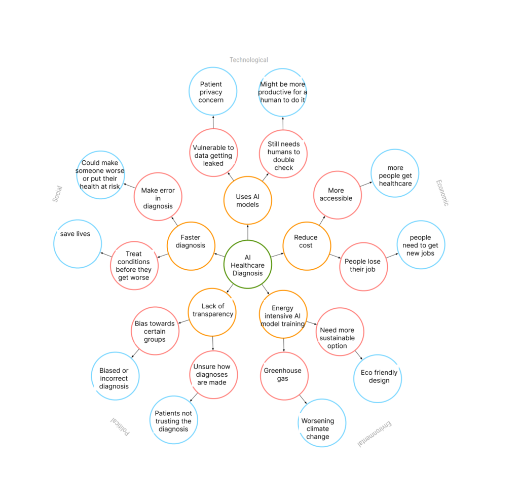
I was thinking about AI in the future that diagnoses people’s health.

I was thinking about AI in the future that diagnoses people’s health.

Interaction designers can be ethical by avoiding dark patterns in design. Dark patterns are when a design tricks users into doing things they might not have meant to do. Manipulative wording of text, manipulating visual emphasis, and creating a false sense of urgency can cause users to make hasty or bad choices on accident. When it comes to AI, interaction designers must make sure to anticipate the AI having biases due to the information it was trained on. We can also try to make the AI less biased. AI algorithms are also often used to give the user more content that they’ll like and make them addicted. It’s important to be aware of the effects that a design could have on a user, positive and negative. Overall, interfaces should be transparent and clear, making the user experience a positive one and having a positive effect on users.
Pace Layers show how parts of IXD change at different speeds. Content, front end code, interaction specs, interaction patterns, and visual design will change from slowest to fastest in that order. The faster parts will be easier to change and innovate. Visual design trends change often, and many companies will want to keep their visual design up to date and trendy. The faster layers are easier to change. The slower layers are important to keep stability and sustainability. They change very slowly. For example, user interactions should be intuitive and consistent. Overall, the different elements make user experiences both consistent and adaptable to user needs.
In the next decade, AI will probably continue to advance and become more capable. I think AI agents will become more commonly used to help people in their life and careers. It would be useful for AI to do simple repetitive tasks so that humans don’t have to, letting humans focus on the more complex things. Although it is also true that AI may replace some careers. I think if someone is skilled at using AI as a tool in their work, they will have an advantage over someone in the same field that doesn’t know how to use AI. Therefore it will be important to know how to use AI to our advantage as a tool.
The iPod/iPhone greatly shifted the nature of our relationship to technology. These new devices allowed people to do many things on one device. People could listen to music, take photos, send emails, use maps, and play games. The iPod/iPhone was also small, so people could easily carry it around. Because of how easy it was to carry them around, people could have them on them at all times, making them a part of everyday life. People could be more social online, and share with other people easily. The devices were also designed to be easy for all people to use. The icons easily showed what the app was and the overall layout was simple. The iPod/iPhone introduced touch-based gestures, which greatly affected interaction design. People could tap, swipe, rotate, drag, and so on. These were new ways for people to interact with a device, and also something new for interaction designers to work on when designing things for the iPod/iPhone. The user interface had to be intuitive so that the user knew what kinds of touch gestures to make. The gestures also had to be consistent between apps so that it would be more intuitive.
Web 2.0 websites focused on letting people interact with each other and share with each other. The websites were also becoming easier to use, so that the average person could use them as well. People were able to comment on each other’s posts, share photos or writing, create online communities, and so on. The interfaces became more visual. There were also ways for users to customize their online identity through profile pictures, descriptions of themself, setting different backgrounds for their page, and so on. This created a virtual community. We still have many of the same features and interactions today. Interfaces are less skeuomorphic now, and there are many more websites and ways to interact with others online.
In a way it does stifle creativity, since the designer can’t just do whatever they want. However this is necessary. If designers could do whatever they wanted without thinking about the user, it wouldn’t make for a very good user experience. When designing for a client it is important to use their design system properly, since it’s a part of their brand. Designers design for others, not for themselves. Designers can be creative while also following the limitations of design systems and design patterns. They can use these guidelines to guide their creativity.
Web-design was focused on the aesthetic and visual pleasure of a design, without focusing as much on the user experience. Over time, the internet became more commonly used by everyday people. As designers started understanding user needs more, user experience became more of a focus. It is important for an interface to be intuitive and usable, and not just pretty to look at. The information should be organized well using information architecture, which helps users find the content that they’re looking for more easily. It is also important not to overwhelm the user with too much information.
The graphical user interface has changed in many ways over time. In the early days the functionality was much more limited. There was also much less color if any used in the interfaces. Today’s graphical user interfaces still use folders and trash symbols. The idea of making design elements look like real objects is still seen today. The graphical user interface makes it so that people don’t have to be computer experts to use a computer, since the design is intuitive and uses visual cues to allow the user to understand how it works. However, the user interfaces now use more color and complex graphics, looking much more realistic and visually appealing. The graphical user interface could improve more by being more customizable, or being more accessible to people with varying abilities. Icons and buttons being clear is also important so that people don’t have to waste time trying to figure things out.
Lucy Suchman had an understanding of people and human society. She used this knowledge to improve the understanding of how design works for people. Lucy had a video recorded of people trying to use a copier machine and struggling greatly. She was one of the early people that would observe how users interact with working prototypes. By understanding the behavior of the user, we can better design with the user in mind. If the user finds something unclear, then that’s a sign that we need to make the design more intuitive. It is extremely important to test prototypes on someone to see if it makes sense or if there are any issues. If we don’t test prototypes, then we could waste time creating a flawed design or a design that doesn’t fulfill its goal well. We use Suchman’s concept of testing prototypes today, and it’s vital to the design process.
The Xerox Star was the first commercial personal computer, and it used technologies that are still prevalent today. It was designed to be intuitive and easy to use for people that were not computer experts. The Xerox Star used icons and folders to make it more intuitive, and this is still done today with modern computers. Everything in the computer system and everything the computer was doing would be shown on the screen. This allowed the user to visualize what they’re doing, making the Xerox Star easier to use. The Xerox Star also used a mouse with two buttons, which we obviously still use nowadays.
The Xerox Star opened the door for user interface design, interaction design, and other roles that hadn’t existed previously. Despite not being commercially successful, the Xerox Star inspired Apple’s later technologies and influenced technology today.
The “Mother of All Demos” was important because it was a major breakthrough in computer technology. It featured an early computer mouse which used a planimeter to monitor rotation. Englebart also showed the oNLine System (NLS). The NLS allowed shared files so that multiple could read the content. Englebart demonstrated how he could type, delete, copy, paste, and move text on the screen. He showed how he could add hyperlinks. The NLS also allowed for video conferencing.
Englebart’s demo was extremely ahead of its time, and people hadn’t seen anything like it. The “Mother of All Demos” is one of the most important and revolutionary progressions in computer history. His work inspired future technology, and is vital to how computers have progressed to where they are today.
I’d never heard of Gestalt principles before but I’ve used some of the principles before without knowing what they were. For example, the principle of proximity. It makes sense to put things that are related close together, so that things that are different stand out and appear separated. I think many of the principles are intuitive and we may do them without realizing. However, having an active awareness of the principles is very useful. Consciously being aware of my design choices will make me make better choices. Being aware of the Gestalt principles also helps broaden my mind to more design options. I found the principle of closure especially interesting. I think it’s a smart way to add more elements and interest to a design while keeping the look minimalistic. This is something that is very useful when creating logos. The Gestalt principles are extremely important for deciding what design elements to use in different situations. I will use them in the future to create work that is visually pleasing and intuitive to use.
Fitt’s law states that people will be faster to click on bigger targets and that targets should be close. I see how important this is, since it saves people time and makes navigating more smooth and efficient. When designing interactive software in the future, I will make sure to make buttons big enough for the user to click on them easily. There have been times when I’ve been using my phone and the button was really small, so I had to struggle to tap on it perfectly with my finger. It’s very annoying when this happens. I will also make sure to space the buttons and elements out well so that it doesn’t take an annoyingly long time to click or scroll.
Ada Lovelace is important to know about because she wrote the first algorithm and computer code. Creating a program that computed Bernoulli numbers was also Ada’s idea. She was inspired by punch card weavers that were used to mechanize the weaving process. Ada also wrote about the details of programming the Analytical Engine. She was extremely in depth, writing about what was possible to compute and what was impractical. Ada was extremely ahead of her time, having ideas about the potential of computers long before computers existed.
Lillian Gilbreth and her husband, Frank Gilbreth, used film to help workers interact with machines. After Frank died, Lilian continued her work and helped make kitchens more user friendly and accessible for women. Her work revolved around helping people and human psychology. Lilian was the first woman in the Society of Industrial Engineers, in the National Academy of Engineering, and the first woman to win the Hoover Medal. She is important to know about because of her improvements to the world, as well as her accomplishments as a woman in a field dominated by men.
I compared the icons in Google Maps to Egyptian hieroglyphics. For Google Maps, some of the icons are obvious while others are more confusing. The microphone icon seems straightforward, since I associate a microphone symbol with verbal speech. This icon is a button that lets the user search with their voice. This concept is easy for me to recognize, however that’s only because I know what a microphone is. Microphones also come in different shapes and sizes, so it may not be as clear that the icon is a microphone unless the user is aware of what a typical microphone icon looks like. The microphone icon is a metaphor since the user doesn’t actually have a microphone that looks like it on their phone. The icon is just communicating the idea of a microphone.


The Egyptian hieroglyphic that I chose is ouroboros. This represents a cycle of life and rebirth. It looks like a serpent eating its tail and forming a circle, creating the eternal cycle of life and rebirth. Ouroboros was not obvious to me, because I am not used to seeing this symbol. To understand the symbol, background information about Egyptian mythology must be known. The serpent eating its tail is a metaphor for the eternal cycle.
Background information must be known in order to understand both the microphone icon and the Ouroboros hieroglyphic. I understood the concepts needed to understand the microphone, however I lacked them for the Ouroboros hieroglyphic. Icons only seem obvious and intuitive if a person has the background concepts to understand them. Both symbols use simplistic imagery to depict more complex concepts.