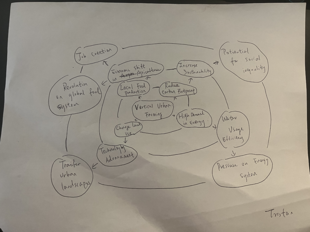
Vertical farming means growing crops in stacked layers inside cities, using special systems that don’t need soil, like hydroponics. It helps produce food locally and reduces the need for transportation.

Vertical farming means growing crops in stacked layers inside cities, using special systems that don’t need soil, like hydroponics. It helps produce food locally and reduces the need for transportation.
I think that interaction designers have an important job to make sure their designs are safe, fair, and respect users, especially when using AI. We need to be clear about how AI works and how user data is used. It’s also important to avoid biases so AI works equally for everyone, and to protect people’s privacy. Also, We should focus on helping people make decisions with AI. They should think about how the technology might be misused and build in protections. Overall, designers should make sure technology helps people in a way that’s respectful and trustworthy.
I think that the iPod and iPhone changed how we interact with technology by making it more personal and portable. These devices put everything like music, apps, communication into one easy-to-use device, which made technology a part of our everyday lives. The touch screen made it simple for anyone to use, even without technical knowledge. This shift meant focusing on simplicity and ease of use. Designers started creating more intuitive interfaces, with clear actions and immediate responses. The goal became to make technology as seamless and natural as possible, which I think is now a standard we expect from most devices.
I see design systems and interaction design patterns as both helpful and a bit limiting for creativity. On one side, these systems provide set rules and ready-to-use components that can make it seem like there’s less room for new ideas because you’re encouraged to follow established guidelines. However, I think these systems can also actually encourage creativity in another way. They take care of the basic design structure, which allows designers to focus on creating new and innovative solutions within that framework. By not having to start from scratch every time, designers can use their creativity to improve and personalize user experiences. So, while these systems might set some boundaries, they also give designers the freedom to explore and innovate within those limits, so being flexible us important, enjoy the convenience but don’t be trapped.
I think that the transition from Web design to User Experience design happened as designers started focusing not just on how a website looks and functions, but on how users interact with and feel about the site. At first, the goal in Web design was to make sites that were visually appealing and functionally smooth. Over time, as more people with diverse needs used the internet, the importance of understanding and improving the entire user experience became evident. UX Design emerged as a field that prioritizes this comprehensive approach, focusing on creating positive, engaging, and user-friendly experiences by deeply understanding users’ needs and behaviors. Since users are satisfied with their experience, then it is a good design.
In my opinion, there are benefits having governments, corporations, and open source communities each involved in developing new technologies. Making profits won’t be the first mission, more patience will be putted in researching and studying.
Also, corporations are great at taking new ideas and making them ready for everyday use, turning them into products quickly and focusing on making a profit. On the other hand, open source ventures make it possible for developers from all over the world to work together on technology projects. This teamwork is transparent and open to anyone, which helps speed up innovation and create stronger, more flexible technologies.
Since the Xerox PARK first worked out a PC with GUI, it has changed a lot. Early GUIs, like those on the original Macintosh and Windows, were pretty simple black-and-white icons, basic shapes, and limited screens. Despite the simplicity, they made computers more accessible. Today, with high-quality screens, we have vibrant, complex icons, animations, and features like touch gestures and dark modes, which make interacting smoother and more natural.
But some basics haven’t changed. The desktop layout, with folders and files, and the windows system for organizing open applications are still here because they’re intuitive. However, one area that could improve is adaptability. Now that tech is so advanced, GUIs could be smarter about adjusting to user habits, like brightness or layout changes based on time or context. It feels like the next step for GUIs is to become more personalized and context-aware.
Lucy Suchman’s work at Xerox changed how we think about whether the technology we design actually works for people. Users often struggle with technology not because they lack skill but because the design doesn’t match how they naturally interact with the world. For example, the copiers were designed with complex instructions that didn’t align with how people usually use machines, leading to errors and frustration. Understanding real user behavior is key to making technology more intuitive and user-friendly.
I think that we can’t just assume a design will work because it looks good or follows technical standards. We need to observe and listen to how people actually use technology in their daily lives. It’s about designing systems that adapt to human behavior rather than forcing users to adapt to the system. This user-centered approach is essential for creating technology that truly works for people.
This experience to the Swissnex Exhibition opened my mind about how AI technology might be used for art works. Normally I won’t used AI to make the art piece itself, but works in the Swissnex Exhibition showed me different possibilities of using AI to make art works with multiple medias. Also those works reminded me that using AI is not a short-cut, a well-developed AI needed to be trained with a lot of effort. A well-trained AI brings great opportunities to produce ideas, and it’s like a friend that understand your thoughts, since it is trained by you. Some works in Swissnex Exhibition provided some impressive ideas, for example, the combination of a game and movies(although it didn’t work well), but the idea of connecting different medias to create a new experience is outstanding.
The Xerox Star, introduced in 1981, it revolutionized the way people interacted with computers by popularizing the graphical user interface. Before its release, most computers required users to input complex text commands, which limited accessibility to those with technical expertise. The Xerox Star changed that by introducing icons, windows, and a mouse-driven interface, which allowing users to interact with computers in a much more visual and intuitive way. This shift toward user-friendly design laid the groundwork for later systems like Apple’s Macintosh and Microsoft Windows, which adopted similar interfaces and brought personal computing to the masses.
I think that the Xerox Star tells me that innovation isn’t just about creating new technology but also about making it more accessible to users. By focusing on how people naturally interact with tools and environments, the Xerox Star pioneered a user-centered approach to design that continues to influence technology today. Even though the Star itself wasn’t commercially successful, it highlights the importance of designing with the end user in mind and how that can shape the future of an industry. Xerox Star shows that successful design isn’t only about immediate success but about laying the foundation for long-term change and also again proves that people/users is always the key in design.
I believed that Douglas Engelbart’s 1968 demo was revolutionary to the world because it introduced technologies that we now use in every day lives, like the computer mouse and graphical user interfaces. Before this demo, computers were largely not easy to access and complex, requiring users to type commands on a blank screen. Engelbart’s vision, though, was for computers to enhance human thinking, making them intuitive tools to help solve problems. Seeing the mouse in action for the first time was a turning point, it was so simple and easy to use, but it opened up an entirely new way of interacting with technology.
I think that what really strikes me is that Engelbart seems like wasn’t just thinking about computers as machines; he saw them as tools to connect people. His demo of collaborative work over a network, and even video conferencing, seems like an early version of what we use today in everything from Zoom calls to shared Google Docs. This influenced people massively. It shows that Engelbart’s ideas were way ahead of their time, and the technologies he demonstrated have really shaped how we communicate and collaborate in the digital age. It makes me realize how visionary thinkers can change the entire course of technology with ideas that seem small but are actually effective and transformative.
I wasn’t realize how psychology can play an important role in interaction design until reading about Gestalt Principles and Fitt’s Law. I didn’t really think of why most of the interactive interfaces are following similar principles, all the studies and experiences have given the best way to build a great user experience.
When doing something needs to guide users silently, Gestalt Principles can be great references. Users may follow the way that designers want them to go, for example some path to important location in video games. And maybe not only visually, also texts can provide similar effects. According to Gestalt Principles, people’s imagination can be powerful and do a lot work, so unconspicuous elements that don’t disturb main design in the interface can be considered.
Fiit’s Law can help me to decide the layout of interfaces and where the most important buttons or icons should be. They should locate at the easiest place on a screen that users can access, and for sure this will depend on different devices, an Ipad and a kiosk will be layouted differently. Users may not have accurate feelings about distance in screens, so sometimes Fitt’s Law may also help to indicate users softly.
Both Fitt’s Law and Gestalt Principles are great and if I can use them well in my design works, I believed that better user experiences will be made.
Ada Lovelace and Lillian Gilbreth are important in Interaction Design history because they made early contributions to how we interact with technology and systems. Also, their outstanding contribution demonstrates the importance of women in the development of this industry.
Lillian Gilbreth, is known for her great work in engineering and also raised I think that is the most important concepts that interaction design follows today were introduced more than a hundred years ago, people factors are the keys.
Ada Lovelace, in the 1800s, wrote the first algorithm for a machine, making her the first “computer programmer”, and she envisioned computers doing more than just calculations. It is amazing that Ada Lovelace could think of things that now it looks like something very futuristic for the time. Interaction design is closely connected with computers and digital devices nowadays, Ada’s groundwork should be credited and honored.
The “Speak” icon in Google Map:

This is the “Speak” icon in Google Map, used for inputing user’s voice to the search bar to find a location, it literally looks like a microphone using really simple elements to be express the concept of “Speak”, like most of the modern “Speak” icons. When people see this icon and notice that it’s a microphone, they will understand this icon stands for “Speak” because microphone is the metaphor of talking.
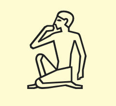
Egyptian hieroglyphic for “Speak”:
https://en.wikipedia.org/wiki/List_of_Egyptian_hieroglyphs

This Egyptian hieroglyphic symbol actually has more than one meanings. It can also represent “eat”, “drink”, “think”, “be silent”, “love”, etc. These meanings are conjectured based on the character’s pose, which is is one knee on the ground and one arm up closing to his mouth. I believe that this symbol tries to express something connect with mouth and head since he is raising arm and being close to his mouth, so all behaviors related with mouth and head can be the possible right answer.
When we look at these two “Speak” icons in different culture backgrounds, they actually don’t really have an obvious similarity. The Google Map “Speak” uses a universal tool that is the symbol of speaking and ancient Egyptians were more direct using a behavior to show the meaning of “Speak”.