Posts by Kiera Shangguan

Magnetic Suspension Transportation Tubes

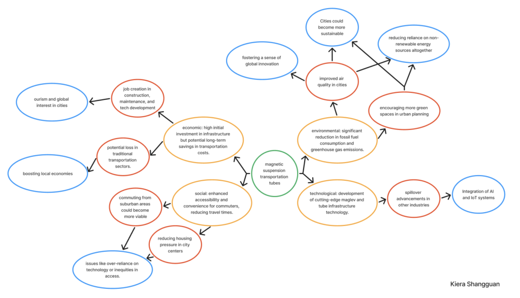
Concept: A city-wide transportation system using magnetic suspension (maglev) tubes that allow pods to zip through seamlessly without wheels. The idea is to revolutionize urban transportation by making it faster, cleaner, and more efficient while addressing challenges like traffic congestion and emissions.

Background:Inspired by the traffic tubes in Zootopia(movie) and maglev train in Shanghai, this system uses magnetic levitation to eliminate the need for traditional wheels and engines. It could drastically reduce the carbon footprint of urban commuting, offering an eco-friendly alternative to cars and buses. At the same time, its implementation would reshape urban infrastructure and lifestyle.

https://www.reddit.com/r/zootopia/comments/77cbaw/this_tube_in_particular_doesnt_actually_appear_to/

https://dewesoft.com/blog/testing-worlds-fastest-train

Good design, bad consequences?

As an interaction designer, I’ve been thinking a lot about our ethical responsibilities, especially when it comes to how social media apps like Instagram or TikTok are designed. Let’s be real—these platforms are engineered to keep us scrolling for hours. Infinite scroll, autoplay, endless notifications—these aren’t just random features. They’re intentional designs meant to hook us, sometimes at the expense of our mental well-being.

This all came into sharper focus for me when I read about a teenager who couldn’t handle being without his phone. His parents locked it in a cabinet during dinner, and instead of enjoying family time, he became so anxious that he broke the cabinet open with a knife to get his phone back. That story hit me hard. It made me realize how much our designs, no matter how clever or successful, can sometimes harm people.

So, what does that mean for us as designers? Well, first off, we need to ask ourselves: are we helping people or just exploiting their attention? Sure, keeping users engaged might feel like a win, but at what cost? People deserve tools that empower them, not designs that manipulate them into spending hours in a digital rabbit hole.

I think our role should be about promoting digital well-being. This could mean creating features that remind users to take breaks, helping them set limits on their screen time, or even just being transparent about how algorithms work. For example, instead of hiding behind “recommended for you,” why not explain why the algorithm is suggesting something? That kind of honesty can build trust and put the user back in control.

Another thing we have to think about is the broader impact of addiction. That teenager at the dinner table is just one example, but it’s a reality for so many people. Our designs shouldn’t be making people anxious or pulling them away from their relationships. Instead, they should encourage healthier interactions—not just with the app, but with the world around them.

Of course, there’s always pressure to meet business goals. More engagement equals more revenue, right? But as designers, we need to push back against practices that harm users. It’s not easy, but I think we have the responsibility to advocate for solutions that strike a balance—helping the business while also protecting the people who use our designs.

In the end, designing for ethics isn’t just about following some checklist. It’s about having empathy and thinking critically about the long-term consequences of what we create. Technology is such a big part of life now, and as designers, we’re shaping how people interact with it. That’s a huge responsibility—and one we need to take seriously.

Museum Visit Reflection

Visiting the exhibition at the Computer History Museum gave me a deep impression of the rapid development of computer technology and its far-reaching impact on all levels of society. The exhibition showed the evolution of computers and AI from early simple machines to today’s complex systems, especially from the historical perspective of how technology has changed the way humans work and live step by step. Some of the classic computer equipment and early technological breakthroughs in the museum made me marvel at the vision and creativity of those pioneers. For example, from the first mechanical computers to the birth of early electronic computers to the emergence of the Internet, the exhibits vividly tell the story behind each technological innovation.

In the exhibition, I was particularly fascinated by the models and prototypes of those early computers. These seemingly bulky and complicated devices are vastly different from modern lightweight and efficient computers, but they are the cornerstones of today’s technological world. From these historical materials, I felt that design is not only the pursuit of form, but also a response to user needs. How designers solve real problems through technological innovation is a valuable learning opportunity for me as an Interaction Design student.

Through this visit, I have gained a deeper understanding of the history of computer technology, and also a better understanding of how as a designer, when facing future technological changes, I can draw inspiration from history, and at the same time, think about how to design products that are smarter, more convenient and humanized.

At the end of the exhibition, the question left for visitors was, “How will AI change our work and life in the next decade?” This question made me think a lot, especially in today’s era of rapid technological change.

I think the development of AI is not just an advancement in technology, it profoundly affects the way we work and the way we live. I can see the transformation of AI from the initial automated processing to today’s ability to perform natural language processing, sentiment analysis, and even create art. This made me realize that in the future, AI will not only be limited to automation and data processing, but may also enter the creative field and become an assistant to designers, artists and even teachers.

In terms of our personal lives, AI will make our interactions with technology more natural and personalized. For example, today’s voice assistants, personalized recommendation systems, and smart homes lay the foundation. In the future, AI may become an invisible assistant in our daily lives, helping us manage our time, our health, and even providing psychological support. But this development also poses privacy and ethical challenges, and we need to make sure that AI technology can protect users’ data and privacy from misuse while enhancing quality of life.

Overall, AI will greatly contribute to transforming work and life, but we must remain vigilant about its ethical and social implications. As designers, I believe we need to design and use AI responsibly to ensure that it can truly create value for society, not just an evolution of technology.

slow-moving foundational & fast-moving surface layers

I would say that Pace Layers, a concept introduced by Stewart Brand, offers a valuable framework to understand the lifecycle of interaction design work. The idea behind Pace Layers is that different elements of a system change at different rates, from the slow-moving foundational layers to the fast-moving surface layers.

The slow layers as the foundational stuff, like usability principles or interaction models, which don’t need constant updates. I feel like these give stability to the designs we create.

I notice that the fast layers, like visual trends or tech-driven features, are where changes happen a lot more often. I’ve experienced how staying on top of these helps keep designs fresh and relevant. But at the same time, I’ve learned that you don’t need to reinvent the wheel with the slower layers—they’re more about consistency and reliability.

I find it helpful to think about Pace Layers when I’m working on a project. I can focus on updating the fast-moving parts, like the UI or specific interactions, without worrying about the deeper layers every time. I also like how this approach keeps designs balanced—staying innovative without losing sight of the core principles.

iPod & iPhone

About why did the iPod/iPhone shift the nature of our relationship to technology? The iPod and iPhone shifted our relationship to technology by making it seamlessly integrated into our daily lives. Before these devices, technology often task-specific, confined to desks or specific settings. With the iPod, Apple redefined how we interact with music, putting thousands of songs in our pockets through app. While the iPhone transformed the way we communicate, work, and even think—introducing the concept of always connected with whatever people or media.

About how does this affect interaction design? From an interaction design perspective, these devices set a new standard for simplicity and emotional connection. They emphasized intuitive interfaces, like the iPod’s click wheel and the iPhone’s multi-touch screen, showing how natural gestures could replace complicated buttons. Interaction design evolved to focus on creating seamless, user-centered experiences that feel like extensions of ourselves. This affects how we design today—prioritizing accessibility, reducing cognitive load, and crafting products that anticipate user needs while blending into everyday life.

Factors Leading From Web Design To UX Design

I think the transition from web design to user experience design is a natural process, just as the Internet has evolved from static display pages to more user interaction-oriented applications.

In my opinion there are several main reasons that have contributed to this shift. First, with the continued development of HTML5, CSS3, and JavaScript, web pages are no longer just static collections of images and text, but allow for more complex interactions and dynamic effects. This provides designers with more room for creativity, while also placing higher demands on design. Second, the popularity of smartphones and tablets allows users to access the Internet anytime and anywhere. This fragmented usage scenario requires designers to pay more attention to the user’s experience on different devices, rather than being limited to the traditional computer screen. Third, users are no longer satisfied with simple access to information; they want websites and applications to be more personalized, smarter, and more responsive to their needs. This has pushed designers from focusing on visual design to focusing on user psychology and behavior.

My Answer Is No.

“Does the use of design systems and interaction design patterns stifle creativity in interaction design? ”is an interesting question. My take on this question is that design systems are the cornerstone of creativity. First of all, a design system provides a unified set of visual language and interaction norms, so that designers can focus more on solving user problems rather than obsessing over every detail. This is like a painter with a color palette and brushes to create more freely. Second, the design system can greatly improve the design efficiency, so that designers can iterate and validate design solutions more quickly. This provides designers with more time to explore new ideas. Third, interaction design patterns are proven solutions that can help designers build high-quality interactions quickly. Finally, interaction design patterns can inspire designers to stand on the shoulders of giants and create better designs.

Overall, design systems and interaction design patterns should be viewed as a tool, not a constraint. Designers should choose and utilize them flexibly according to specific design needs. And add their own personalized elements to the design systems and interaction design patterns.

Yes, they should

I believe that governments, corporations or open source ventures community should all play an important role in technological innovation. It is true that the investment of the U.S. government, corporations or open source ventures has laid a solid foundation for the development of infrastructure such as the Internet. However, there are limitations to leaving technological innovation entirely in the hands of a single entity, be it the government, corporations, or the open source community.

I prefer a pluralistic model of innovation:

A.Government: The government should continue to support basic research and cutting-edge technology exploration, and provide the necessary financial and policy guarantees for innovation. At the same time, the government should also focus on transforming research results into practical applications to promote social progress.


B.Enterprises: Enterprises, as the main players in marketization, are more capable of capturing market demand and transforming technological innovation into products and services. Enterprises should increase investment in technology research and development, while focusing on the combination of technology and business model.

C.Open source communities: Open source communities are an important force for innovation, promoting rapid technology iteration and popularization through open collaboration. Open source communities should receive more support and encouragement.


In addition to the three types of subjects mentioned above, individuals, entrepreneurs and designers should also have the right to invent and create. They often have unique perspectives and creativity that can produce breakthrough innovations in niche fields. This diversified innovation model can ensure the full utilization of existing resources, prevent large organizations from monopolizing technology, and promote the universality and development of technology.

Changes/ Remains/ Suggestions

The graphical user interface (GUI) has evolved significantly since the early Macintosh/Windows days. Modern GUIs are now adaptive, adjusting to different screen sizes and devices to provide a consistent user experience. Additionally, interaction methods have diversified beyond traditional mouse and keyboard input. Touchscreens, gestures, and voice commands have become commonplace, and emerging technologies like AR and VR are opening up new possibilities for GUI interaction.

Meanwhile, the core principles of GUIs have remained relatively constant. First, GUI continue to emphasize intuitiveness,use simple shapes and colors to convey information to help users quickly understand and operate. Second, consistent design across different applications and platforms helps users quickly learn new applications.

Despite these advancements, there is still room for improvement. I think the critical area that demands greater attention is accessibility. GUI design should prioritize inclusivity, ensuring that everyone, including individuals with disabilities, can interact with GUIs seamlessly.

AI Arts Surprise Me

Firstly, all AI-generated Arts give me a cyberpunk and interactive feeling.

Regarding the cyberpunk feel, some posters have cool colors like blue, purple, and green, as well as warm colors like red, orange, and yellow. These color combinations create a mysterious, dreamy, and technologically advanced atmosphere. The use of materials like metal and glass also adds to the cyberpunk texture of the posters.

As for the interactive feel, one work connects games and movies, allowing players to play a mobile adventure game while watching movie clips. It cleverly combines games and movies, allowing the audience to participate in the mobile adventure game while watching movie clips. This interactive design not only firmly grabs the audience’s attention but also invites the audience to actively participate in the work.


On the other hand, I also appreciate the entire studio’s layout and decoration. The studio provides a spacious exhibition hall, a comfortable rest area, an open discussion area, an office area, and even a balcony facing the sea. The studio uses warm tones. I think no one can refuse to work in such a beautiful studio. I hope CCA can learn more from them, and CCA folks also want such a campus environment!

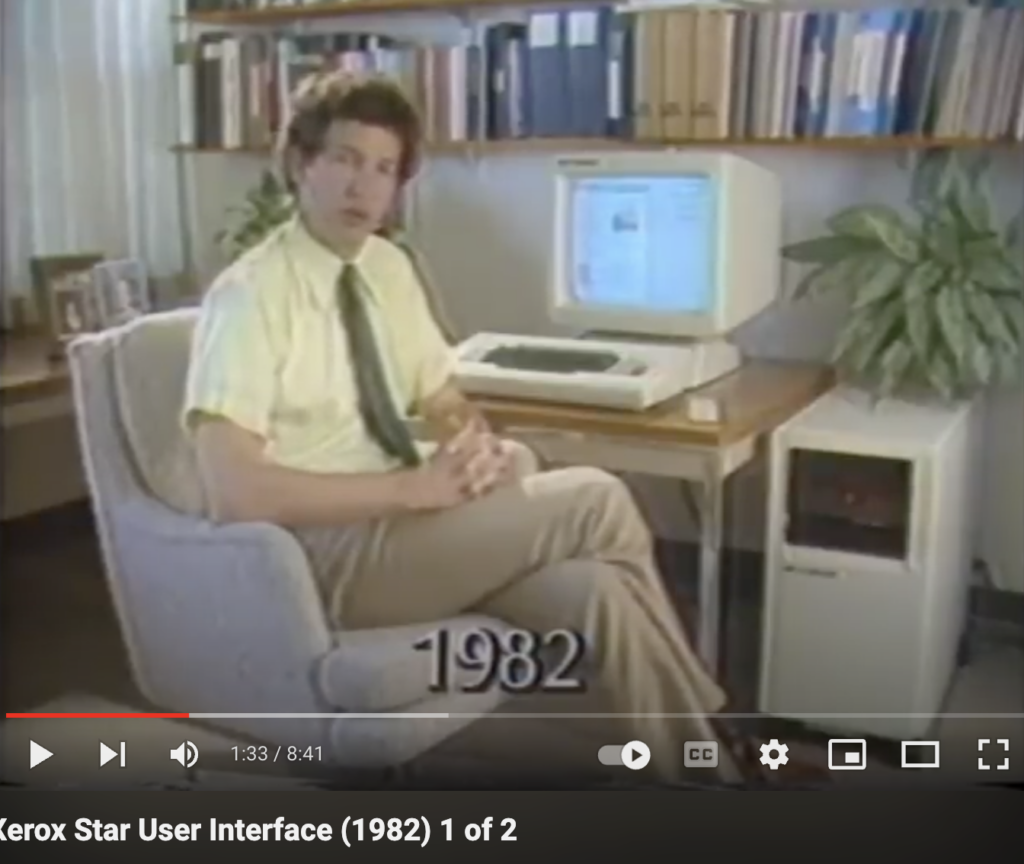
Xerox Star changed computing in 4 key ways

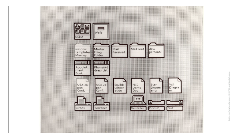
First, the Star introduced a revolutionary GUI that used icons, menus, and a mouse to interact with the computer. This made it much more intuitive and accessible to non-technical users.

Second, the Star’s GUI also incorporated What You See Is What You Get(WYSIWYG) editing, allowing users to see exactly how their documents would look before printing them. This was a major improvement over previous systems where users had to rely on codes or special commands to format their text.

Third, the Star was one of the first personal computers to be designed for networking, allowing users to share files, printers, and other resources across a network.

Finally, the Star’s inspired other companies.

Revolution and Forethought Make Douglas Engelbart And The Team Important

First, Douglas Engelbart and the team brings pioneering user interface, such as mouse, GUI and hypertext. They are all incredible revolution.

Second, Douglas Engelbart and the team show how laptop could use for online communication and cooperation. Which is huge forethought and give all researchers more motivation and purpose.

My Thoughts On The Computer History Museum Presentation

Fei-Fei Li’s presentation at the AI Journey was an insightful dive into the history and evolution of AI and its profound impact on the fields of IXD and beyond.

One of the most striking AI history for me is “the field of AI and machine learning found its language and that language through statistics, through machine learning start to crack individual fields like natural language programming, computer vision, speech recognition and researcher start working theses fields in pretty deep ways.” Fei-Fei Li share this revolution of AI reminded me of how machine learning’s influence is broad, touching various fields that are central to creating intuitive and intelligent user experiences. I believe integrate AI into ixd designs that anticipate user needs, making interfaces smarter and more responsive.

Another key learning was “3 fundamental elements of modern AI converge for the first time. That was namely neuron network – this is why Tom was quizzing you on back propagation that was the mathematical underlying mathematics of neuron network. So the first one is neuron network. The second one is big data using image net. The third element is GPU Computing and at that time it was two GPUS.” This is the first time I heard the 3 fundamental elements of modern AI converge, they came together with vast datasets. This combination allowed machines to learn faster and more accurately than ever before. In this case, I realize how important the vast data when building complex systems. Which also makes me think about ixd design. Such as mind map, Behavior over Time diagram,Concept Model diagram, Causal Loop diagram, Connection Circle Diagram and etc all create base on data and information. Thus, AI could help ixd designer find the reliable resource faster. AI recommend accurate article very soon.

What I will consider Gestalt principles and Fitt’s Law in my future ixd design

First, about Gestalt principles using in my future ixd design.

1.Similarity. This is most about unity in one design. All the typeface/color/logo/overall brand idea/concept/etc have to be in one style. Which means the brand book is very important to made.

2.Good Figure. Make a obvious different between background and content. Thus, users would’t be disturb when they are reading the content.

3.Proximity.I will place all the similar function/bottom/information/icon/ect near each other. Thus, users can find the category they want more quickly and accurately.

4.Continuity.If I’m developing an app, I will first consider the concept map, causal map, and stock flow before starting the actual build. These maps help create a smoother user experience and provide a clear vision of how the app should function.

5.Closure. The end and start should be super easy recognizable for users. Thus , the page for part for end and start have to include clear symbols.

6.Common Region. Think about what element are in one same group. Then make them moving or toward in one direction.


Second, about Fitt’s Law using in my future ixd design. I’d also make sure that interactive elements follow Fitts’ Law to improve usability:

Long in short, the theory of Fitt’s Law is the farther away a target is and the smaller it is, the longer it takes to reach. In opposite, the closer and larger a target is, the easier it is to interact with. Base on this, I will design the bottom, icon, image and etc that are expect to click mostly have to be as big as esay to achieve and click on accurately by mouse or finger.

Woman Deserve Recognition and Respect

First, I do fully agree and support Erin Pinot’s point that in the history of ixd, contributions from women have often been overlooked. In this case, highlighting figures like Ada Lovelace and Lillian Gilbreth corrects this historical oversight and tell the world how brilliant woman are. Also that highlight of Ada Lovelace and Lillian Gilbreth enriches our understanding of the field’s evolution. Both women made foundational contributions that resonate with principles central to Ixd.

Ada Lovelace and Lillian Gilbreth have made invaluable contributions to the evolution of IXD, and their individual academic achievements are also outstanding. Ada Lovelace is the first computer programmer. Her work on analytical Engine, included creating the first algorithm intended for implementation on a machine. This work laid foundational principles for computer science and programming. Lillian Gilbreth spend her life for building the field of industrial engineering around the world. She is also the first female member of the society of industrial engineers; the first woman ever appointed to the national academy of engineering; the first woman who receive the hoover medal for distinguished public service; She was the first female psychologist with U.S postage stamp named for her; etc. All Lillian Gilbreth did is incredible, remarkable and continue to inspire.

Ada Lovelace and Lillian Gilbreth are the role model for woman. They show me that there are no limit on what woman can do. Their accomplishments encourage women to be brave and pursue their goals. Woman can accomplished anything. No one can define our potential.

Gmail and original alphabet

  • What’s being communicated?

Here is the ‘Browser’ section in Gmail. Multiple icons are used to represent different categories. Such as a trash can is using to symbol spam, a clock is using to symbol delay, etc.

  • What concepts need to be learned?

I think the concepts behind Gmail’s icons are: 1. All the icons are created based on real-world symbols. 2. Each icon represents a whole word or concept, not just a single letter.

In addition, the appearance of Gmail’s icons and the original Sumerian alphabet, Mayan pictographs, or Egyptian hieroglyphics is different. The original symbols rely more on lines, while Gmail’s icons rely more on shapes.

  • What metaphors are being used?

Gmail’s:
1.star = important; 2.inbox = mailbox; 3.arrow = sent; 4.plus = create a new; etc.

original Sumerian alphabet:
1.quadrangle = sun; 2.triangle+f = bird; etc.