Compared with modern icons, original icons are more abstract and complex. As time goes by, we can clearly feel that modern icons will be more iconic than before. However, the appearance of a small number of icons does not seem to have changed much from ancient times to the present. If viewed from the current perspective, they can still be easily read.
I found two icons on Slack that represent people, or more appropriately, users. After you click in, you can find information about yourself. But there are two different images. The first one is a circle with very simple facial features, namely nose and eyes, which represents me, the user. And when we click in, another representative user icon appears. We can see them in many places. A semicircle is connected to a circle. It is very simple and represents our shoulders, chest and head respectively.


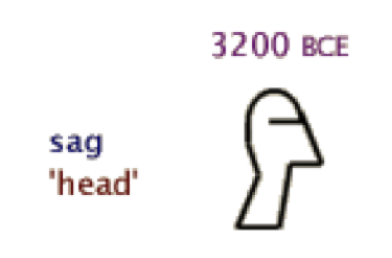
When we look at human representation in Egyptian hieroglyphics, I see expressions from the 3200 BCE period. During that period, human icons were more abstract, consisting of an oval and rectangle representing the head and neck respectively, while a sharp triangle and a straight line represented the mouth and chin. Obviously, in the early days, the icon would be more abstract, but it is not difficult to see that it represents “people”.
Now, when we make icons, we need to pay more attention to how to simplify and make them more pictographic, and they need to be unified so that people can better understand their meaning. Just like the “human” icon, it needs to be anthropomorphic and the way of expression is simpler, so that people can communicate more easily.