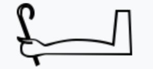
WeChat is a popular social app from China, features a “Discover” section symbolized by a compass—a perfect choice, as it universally represents exploration and discovery. This concept isn’t entirely new. While I haven’t found a direct equivalent for “discover” in ancient Egyptian hieroglyphs, symbols like 𓈉 meaning “faraway” or “travel” and 𓂡 is a stepping figure symbolizing “progress” convey similar ideas through simple visuals. Both ancient and modern designs rely on familiar imagery to communicate meaning effectively.

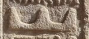
The compass icon works well because it taps into a global understanding of direction and navigation, making it intuitive even without text. Similarly, ancient Egyptians used 𓈉 depicting a sun, mountains, and a road and 𓂡 to symbolize movement and exploration. This shows how humans across eras have used real-world objects to create meaningful symbols.
However, modern icons prioritize simplicity and universality, allowing instant recognition, while ancient hieroglyphs required cultural knowledge to interpret. Another parallel is the shared metaphor of movement: both the compass and 𓂡 imply exploration, though modern icons are more abstract and minimalist, suited for today’s digital interfaces.
In my view, this comparison highlights a fundamental similarity: both use visuals to convey meaning quickly. The key difference is accessibility—modern icons are globally intuitive, while ancient symbols were culturally specific. As UI design evolves with AR and VR, the core principle will likely remain: using simple visuals to communicate ideas instantly.